If you are new to the Band, this post is an introduction and overview of the point of this blog that needs updating. Older posts are in the archive on the right. Shorter occult posts and reflections on reality and knowledge have menu pages above.
Comments are welcome, but moderated for obvious reasons. If you don't see it right away, don't worry. We check a couple times a day and it will be up there. |
| Pisanello, Madonna of the Quail, 1420, tempera, Castelvecchio Museum, Verona |
Things seem to have fallen into a pattern at the Band, alternating art of the West, speculative, and occult threads. There are other things we want to do - positive ideas like The Silmarillion posts that occupied us for a while. But the art posts have some of that, and we don't want to get too spread out. Especially since they take longer to pull together. So we'll stay with this pattern for now, meaning it's time to take up the arts of the West again.
This painting is in a style usually called the International Gothic - the last phase of Gothic art. Gothic had less impact in Italy, but the late Gothic painting there is among the best. The aristocratic elegance, curving lines, delicate beauty, and overall courtly air are signs of the International Gothic.
The last few art posts have looked at the development of the Gothic as a pan-European style at the end of the Middle Ages. We've added a new link at the top covering the Arts of the West. So far, we've got all the medieval art and supporting material posts there now.

Don Simone Camaldolese, Adoration of the Magi and historiated “E” (Ecce avenit), Leaf from a gradual, tempera, gold and ink on vellum
Here's the complete topic list if you're interested in how we got here. Didn't realize there was this much.
Emergent globalism and Romanesque
Birth of Gothic and Churchianity
Parasitic medieval aristocracy
Gothic architecture pt. 1
Gothic architecture pt. 2
Occult Post on Gothic
What is the Art of the West?
Gothic Sculpture and Aristocratic Values
Gothic painting, Aristocrats, and the concept of Art
Italian Gothic Painting

The International Gothic had been criticized by some historians as being too generalized to really mean anything. But whatever it's called, there is a elegant, aristocratic Gothic art that turns up in all the late medieval courts and other elite settings.
The detail and elegance is clear in this close-up. But also note the realism with solid figures arranged sensibly in rational space.
All these medieval posts are just part of a larger artistic journey that went back to the roots of the West to understand what art is. We needed to do that to understand how we came to the atrocity of Modernism in the 20th century. But the journey has proven much longer and more interesting than anticipated. Being ontologically, historically, and logically responsible has given us
1. a working definition for the art of the West
2. appreciation of how important art is in culture formation
3. an understanding of how the art and society of the West developed together.

Hugh of St. Victor, from a 14th-century copy of his Speculum de mysteriis ecclesiae, Bibliothèque Nationale de France, Latin 2540 f.1r.
The Gothic has taken time, because the standard historical narrative didn't match the available historical record. The same period of time that gave us Gothic art and architecture also saw:
✅ development of national monarchies
✅ development of internationalist aristocracy
✅ blurring of secular and sacred
✅ invention of international finance
✅ urbanization
✅ material prosperity
✅ appearance of university
✅ art as a thing
It's not Hugh's fault though. He was a monastic theologian who died in 1141 - when Suger's Gothic was just beginning and IG splendor centuries off.
In the West, art was how cultures defined and expressed themselves - to their own time and to history. It's why we're running a short cycle of posts parallel to these ones on how different things make and convey meaning. The second one considered pictures and the next will do art because these are hugely important aspects of what we are and where we came from.
One other thing that's become clear is how important. Realizing how big the Western arts are - how many different peoples, traditions, styles, periods, purposes - is dizzying. And all of it giving visual form to defining truths of our Western heritages across history.

Joseph Höger, Chapel on the Woods, 1850, oil on canvas, private collection
Like the combination of landscape, faith, and people that make up a national culture.
Note how the figure and chapel line up at the center of the forest. Look how the road makes an angle pointing at the chapel with the figure at the point.
We can see what they saw - share a real experience with them. Did share experiences with them for generations and generations. Until modernism. Consider this quote from Gerhard Richter - the artist that this link says set record for auction price for a living European artist when his drop cloth went for over $46 million.
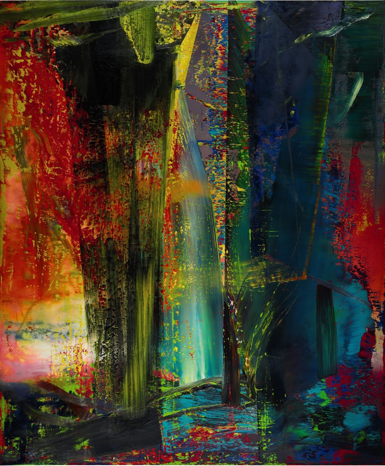
Gerhard Richter, Abstraktes Bild, 1986, oil on canvas, private collection
"Art is not a substitute religion: it is a religion (in the true sense of the word: ‘binding back’, ‘binding’ to the unknowable, transcending reason, transcendent being). But the church is no longer adequate as a means of affording experience of the transcendental, and of making religion real – and so art has been transformed from a means into the sole provider of religion: which means religion itself."
Note the spray of symbols nonsense way of writing. Postmodernism and the occult are both manifestations of the same satanic inversion.
The depredations of modernism didn't just debase and invert culture. They broke a vital link that tied us together for centuries. Than tried to bury the memory. No wonder this is taking a lot of posts.
This post grew longer than intended is is divided into two parts. Part I has some more thoughts on the nature of the art of the West and its relation to function. The main topic is the English Gothic and German Gothic and the patterns uniting the various forms of Gothic art. Just like Gothic architecture, different areas have their own take on a common set of features. Sort of like the occult and postmodernism, but not evil. Part II will deal with the International Gothic and what it meant historically. If we are looking for the beginnings of an international art "scene" this would be the place to look. Then the arts of the West posts will move into the Renaissance. Things get quite different then - in art and the West.

Sandro Botticelli, The Birth of Venus, 1486, tempera on canvas, Uffizi, Florence
The Band's working definition of art is the use of artisanal skill [techne] to express higher truth or principles [episteme] in visible material form. This means we're dealing with something that connects levels of reality and has to be dealt with from different points of view.
At the highest level - ultimate reality - are the foundational truths that art expresses. Episteme in our Greek terminology. In the West, this is Logos - the thread that ties Creation together. It's complex because logos manifests differently on each level of reality.

Episteme is called to mind by pictures, but can't be depicted directly in itself. The problem with our material existence is that it's material. We are limited to material means like sense data and constrained by subjective mental processing. Then there's the whole semiotic problem of translating inner impressions - themselves subjectively formed - into imperfect signs and sending them out to other subjectivities.

This puts at the bottom of the ontological hierarchy, meaning that as we move up, absolute certainty gets simultaneously closer and less clear.
Since art is material level expression - all the levels of reality have to be translated into material visual representation.
So even when we are referring to the higher truths in art, they are being mediated through techne - meaning we are always dealing with physical pictures on some level.

Jean Colombe, God Creates the World from the Hours of Louis de Laval, 1480-1485, illumination on parchment, Bibliothèque nationale de France, Latin 920, f.2r
God doesn't really look like a guy with a beard and creation wasn't concentric rings of angels around a black dot like an eye. These are representations. Pictures. Things to call concepts or ideas that are beyond representation to mind.
The patriarch in gilded robes is a symbol of authority and wisdom who literally begets his family. The heavenly host contrasts with the blank slate of the world, and the eye tells us it this is a representation that our limited senses can grasp. It's so we can "see" it.
This is the basis for the Postmodern lie that reality is made of sign systems. It's true that any discussion of reality involves material signs, but not being retarded, we aren't flummoxed by the concept of associative meaning. This means that ultimate reality in art is a material reference to a God who is beyond direct perception. Now go back to the Richter quote for a second.
"...art has been transformed from a means into the sole provider of religion: which means religion itself."
There it is, stated in plain sight. It's the satanic impulse to replace religion with meaningless splatters of color. Richter is far from the only Modernist fraud with delusions of prophethood. All kinds of 20th-century artists - Europeans like Wassily Kandinsky and Abstract Expressionists like Barnett Newman and Mark Rothko - express the same presumptive evil.

Mark Rothko, Black in Deep Red, 1957, oil on canvas, private collection
“The people who weep before my pictures are having the same religious experience I had when I painted them. And if you, as you say, are moved only by their color relationships, then you miss the point!”
Understanding how beast system lies work, the Band would wager handsomely that no one was moved to tears by this shit. Apart maybe from a buyer sobering up and looking at the receipt. But it's the message. The ideal that this rotting bloated carcass of a fake tradition could inject a spiritual dimension into a materialist hellscape.
There is a demented metaphysics in Art! - it's just not descriptive of anything real. Indulge this for a moment. If art is autonomous, it has to be self-referential. If it can't refer to anything else, it can only "be"... itself. The Band has described Modernism as recursive for this reason - things that only reflect back on the same fake world of art. If we string these into a sequence and call it a tradition, we just get an endless chain reflecting back on itself. Recursion.
Now for the magic of

Discourse is the hollow jargon that masquerades as reality in academic circles. Only certain thoughts are permitted, but the permitted thoughts can be mixed and matched at will. That's called "theory". One permitted thought is the deconstructive notion that the endless, recursive, chain of self-referentiality found in signs can be described as an infinite deferral of meaning. Not the absence of meaning but the endless suspension. These are the same in practical terms, but the suspension has a sort of ghost existence that the absence doesn't. This is Derrida's "trace" and it's how the deconstructionists tried to account for the fact that words are capable of functional communication.
The idea that there is always a "meaning" or sorts - a definition anyhow - but it only points to more signs. Like art just referencing art. This matters because it turns the lack of meaning in signs into a process rather than a steady state. Endlessly pointing back to itself - like a repeating quotient in division.

No matter how many times you perform the operation, you will never reach the answer. The number system is not capable of expressing this exact amount.
The limits of the sign system does not mean the quantity doesn't exist. It's 11 divided 6 ways. But if we pretend signs are reality, the amount is infinitely deferred and never reached.

And since infinity is unreachable in a finite world, this semiotic recursion becomes a "void" or endless abyss. It's what all signs ultimately mean.
Certain clever boys noticed a structural similarity between this endless process of deferral and the unreachable God-in-Himself that is beyond all grasp in mystical theology. If course it's an inversion - endless absence and endless presence both exceed closure, but in different directions. But there's an even bigger inversion.
Infinite presence is ultimate reality - the source of the Creation within which us and our word games are flickering sparks of irrelevance. The infinite void is a word game. A bit of verbal play based on pretending not to understand how association works.

Barkley Simpson, Adam and Eve at Creation, 2011
One is the path to salvation.
The other... isn't.
The Richter quote reveals the satanic desire to replace God that defines evil lurking at globalism's gangrenous heart. Remember when these soul-sold blather on about mystical unknowables...
Their ultimate reality is a void
It sounds simple to say that the ultimate reality aspect of the art of the West - the episteme that the techne expresses - is a material reference to God through Logos. There are some clear examples of that in this post. But think of all the philosophical, moral, social, ritual, and however many other things extend from God. All of these are can provide subjects for techne to to use to visualize ultimate reality in some way.

William Holman Hunt, The Light of the World, 1900-1904, St. Paul's Cathedral
The Christian Truth is clear in the third and most mystical version of Hunt's masterpiece. This one has a carved Renaissance-style frame that's like a piece of architecture.
Divine revelation shining through a rational Classical structure is the perfect metaphor for the metaphysics of the West.

Johann Gottfried Steffan, In the Nesttal, Canton Glarus, 19th century, oil on canvas, private collection
Sometimes the logos isn't as obvious. But when you're aware of how reality is bound together, the beauty and order of Creation and the nations occupying it also visualized truth.
The thing that differentiates art from a well-made craft is the cause or motivating force. Something like a cabinet is visually pleasing, but the physical attractiveness is a secondary feature. It's primary purpose is to hold things, and if it were plain looking it would still work. The beauty - the truth - is in the smooth and skillful performance of function, and in the more intellectually complex application of decoration to the function in a harmonious way.

George III mahogany breakfront secretaire bookcase, made around 1770 from a private auction
Like this piece of fine antique furniture. It's beautiful in it's functional elegance and has some purely aesthetic features like the volutes and classical moldings around the top. But the decorations are secondary to the purpose of efficiently storing books and things, not the reason for the work. It would work without them - which is pretty much the whole justification for repulsive subhuman Moderisms like "minimalism" and "functionalism".
The artwork is different. It's purpose is the message or beauty that it conveys. It can show an ultimate-reality, abstract, or material-reality level subject. It can even tie them together. But it's the depiction that is the primary purpose. It's a picture, and pictures depict. It's in the name.
Idiot modernist absolutists pretended that this function vs. no function distinction was litmus test for Art! - it was the functionlessness that provided the cover for the mentally crippled notion of autonomy. And speaking of recursive, declaring that some retarded desire is the "correct" side of a fake binary you made up is so far beyond tedious that is should be grounds for instant banishment.

André Masson, Automatic drawing made in Paris, 1924, Museum of Modern Art, New York
Art's not half of a "binary" - it's a definition. There are no purposeless objects, because no one makes things for no reason. Surrealism tried to create subconscious art, but even if that had been possible, setting up the conditions to show purposeless creation is a purpose.
Put it another way - Modernists get aroused at the idea of form follows function. Humor them for a moment. If the function is to depict an idea then the form is... a picture.
It can still give us pause to consider how so many nominally clever people submitted to such transparent falsehoods for so long. Then we remember that the world being Fallen means something.
The purpose of art is to represent, and if it represents logos in a skilled way, it's art. And if it is on something practical like a table top, we have to...
wait for it...
differentiate between the useful object and the "art" 😁

Attributed to the Villa Giulia Painter, Attic red-figure, white-ground kylix (drinking cup), from around 470 BC, terracotta, Metropolitan Museum of Art.
Like this bit of fine Classical painting. Functional objects like this shallow drinking cup are a primary source of information about Greek art.

Attributed to Douris, Attic red-figure kylix with Dionysos and Satyr and Maenads, around 480 BC, terracotta, Cleveland Museum of Art
This what a kylix looks like, and here's the one from above on display at the Met. We couldn't find a picture of the Met one from the side so this one from Cleveland will do. The kylix was a very shallow drinking cup or bowl that appears to have been popular at symposia and other social celebrations.
Is this an "artwork"? Is it a functional object or is the primary purpose to represent? The answer?
Both.

Pedieus Painter, Musician supporting a drunken banqueter from an Attic red-figure kylix of around 510 BC, terracotta, Louvre Museum
This is a painting from a kylix showing partiers holding one. It's meta, but it shows the distinct shape. It's a functional object, and it works regardless of decor.
The kylix doesn't need a painting on it to do it's function...

...and the picture can be on anything
We can take the painting from the kylix bowl, put a frame around it, and we have a nice piece of ancient Greek art, suitable for hanging.
Assuming the representation has that epistemic ultimate reality base, it's a work of art. Whatever it's on. .
Is it art? Is it functional? It's both - a cup that also is the support for a representation. Ignore the retarded fake binaries of liars and idiots and ask the simple question, what does it do? This is the material world, where things happen in time. The main insight in the Heidegger post was that temporality is a central characteristic for differentiating material reality from higher, more abstract states. Asking the nature of something's being-in-time is a fancy way of asking what it does. Art represents logos in techne.

This has been a lot on the ultimate reality aspect of art. These ideas are being worked out as we write, and it's not clear where things are going to go because the maps are all corrupted. Asides like this are where we are working it out. Walking through our thinking lets you see where we're coming from and separates us from Philosopher's Names and other fake authorities with their vain projections.
And this is without touching on what appears to be changes in spirituality as the Middle Ages progress. Historians have noted that the increase in religious imagery came at the same time as other forms of expressive public devotion like pilgrimage, the Corpus Christi feasts, and charismatic movements - orthodox and heterodox alike.

Giotto?, Sermon to the Birds, 1297-99, fresco, Legend of St Francis, Upper Church, San Francesco, Assisi
The remarkable frescos at Assisi that kicked off the medieval Italian move towards realism were made for one of these new movements - the Franciscans. Their attitude towards the natural world and charismatic preaching are right in line with this changing spirituality.
We also have to consider art from an abstract point of view, because that's where the notion of a theory of "art" belongs. Any theoretical construct - our Greek-derived terms or the Art! of the globopedo modernism - is an abstract concept generalized from real-world examples. The question here is if the abstracts are in line with ultimate reality above and material reality below. Are they true?

Counterclockwise from top left:
A. W. N. Pugin design, Gothic Revival settle with the Salvin family crest, 3rd quarter 18th century; Henry Moore, Reclining Figure, conceived 1939, cast 1959, bronze, private collection; Madonna of Krumlov, 1393, polychrome wood, Arts and Crafts Museum, Vienna
If we want a special category of representation called the art of the West, it can't be techne with another primary purpose or the no techne no episteme humiliation rituals of modernism. It's techne plus episteme - logos. Like this International Gothic statue.
A theoretical concept of art doesn't tell you what each piece looks like. It tells you what it has to be.
On the material level is the art itself. Material objects of techne that come in almost endless styles and forms. Art is always changing because it is the visual expression of the experience and identity of a culture or people. As the circumstances change, so does the art, just not always in predictable ways. We can't even dream of covering it all - but we can trace out the big patterns and where the official historical narratives are wrong.

Pentecost, from the Black Hours, made in Bruges around 1475-1480, Morgan Library MS M.493 f.18v, 19r
Incredible luxury manuscript with the vellum dyed dark bluish black with iron gall ink. This expensive process was also corrosive - this is one of seven black books of hours and the best preserved. The letters are gilt silver and gold.
And we get to see what they did.

English Gothic art
We aren't going to spend much time here - just enough to see that the English Gothic shows the same general pattern as the French, but differs in the details. Romanesque England - like Italy - was culturally different. It's Germanic Migration period culture was Anglo-Saxon, not Frankish, and it was never part of the Carolingian Empire.
This classic old map gives an idea of the different phases of Charlemagne's expansion. The British Isles remained outside as a mix of small territories. The Danes held sway over much of the East at this point, having not yet been scoured.

William Robert Shepherd, Divisions of the Carolingian Empire, Verdun, Meerssen, 1923
The Band often points out that the nature of the West is shaped by the interplay of the different levels of reality. The shared higher level framing - Christian faith and the Classical legacy of abstract thought - account for a unity that differentiates the West from other regional blocks. But within that frame, material level differences in people and their shared experiences gives us a slew of different national cultures. England is a fine example - Christianity and the Classical heritage are present, but the cultural form it takes is different from other places we've considered.

England at the end of the Carolingian era. The Heptarchy - seven Anglo-Saxon kingdoms - were flanked by small Welsh states and Scotland. The Danelaw was under Danish rule until they were scoured completely from the island.
Celtic culture was stronger here and Roman less so, though classical influences are present. Apologies for the blurry map - we are limited to things on the internet that appear historically reliable.

On the eve of the Norman Conquest in 1066, the Anglo-Saxon kingdoms formed what is essentially modern England. In 1065, the country was mainly controlled by the feudal networks of two families. The family of Harold Godwinson - the last Anglo-Saxon king - ruled the pink region to the south.
This map shows Great Britian developing around national lines. The Scots and Irish (not on this map) were Celtic Gaels and the Welsh the remains of the old Romano-Britons displaced by the Anglo-Saxons. This is why, despite sharing relatively small Islands and enduring constant English aggression, the national cultures of Great Britain are so distinct. We've already seen the unique Irish manuscripts of the earlier Middle Ages. Britain's unique cultural make-up means its art will show a different mix of influences than the continent. Not just formative, but ongoing.

The relationship with France becomes complex after the Norman Conquest. Great Britian already had a unique cultural blend - this further complicated it while strengthening the ties to Europe. These ties filled subsequent centuries with warfare - most often with France - and brought more intense cultural contact with continental developments.
The Normans also had Germanic Migration Period roots, but were part of the splinter that originally settled in Scandinavia and developed Viking culture. Norman - Norseman. Granted land in France as a hedge against continued Viking raiding, the Normans used this as a base to conquer England and Sicily. They were also great builders in stone - the Normans introduced the grand architecture that became the English Romanesque then Gothic. Culturally, they added a Latin-based French dimension to the language and tied the elites more closely to the continent.

The Norman dimension brought closer European ties, and with those, grand ambitions. The Angevin Empire reached it's peak a century after the Conquest, extending England's continental rule to its greatest extent.
The Hundred Years War to follow between England and France was fought over these territories and profoundly effected the development of both countries. The whole time facilitating cultural influences.
We aren't going to try and recap the whole history of English medieval art - the point is a quick look at the Gothic. We can't trace out how all the influences - Norman/French, Anglo-Saxon, Celtic, Classical - mix and match in different times and places. It's enough to know that they are all there in different proportions and can be referenced when needed. So let's start with a masterpiece of the late English Romanesque/early Gothic as a point of departure to set the context.
The Winchester Bible was made for the Winchester Cathedral somewhere around 1170. Like with architecture, the Gothic comes a little later to English art than French. It's the largest surviving 12th-century English Bible and one of the most lavish anywhere, with 468 sheets of calf-skin parchment. According to the site, that's 250 calves. When you consider the level of material wealth possessed by the average Middle Age household, you realize how valuable these books were.

The Winchester Bible, 1160–75, possibly worked on until 1190, tempera and gold on parchment, Winchester Cathedral, Opening for the Book of Genesis: In Principio, f.5r
Genesis opens with an incredible initial that summarizes the whole Bible in a single character. The close-up shows the familiar Romanesque style - linear and energetic surface art more interested in expression than realism.

Here's a large picture of an initial with good color reproduction. It shows God putting words in the mouth of the Prophet Jeremiah. The flat linear design and bright colors are obvious in this one.
This striking picture is a good opportunity to introduce the medieval painter's tools. Manuscripts were on animal hide - parchment or vellum - since papermaking didn't reach Europe until the 12th century. This meant medieval books stayed very expensive into the Gothic era. Pictures were done in inks and paints made of natural materials.
Paints are made up of pigments - the color - and binders - the liquid that the pigment is mixed in to bind it to the surface. Medieval paints were usually tempera, where egg is used as the binder. Gum arabic - the sap from acacia trees - was used as the binder for watercolor and ink and was acquired through trade with the Middle East and Africa. Pigments were mineral or plant based and varied from place to place. Ultramarine blue like the kind seen here was made from lapis lazuli, a semi-precious stone from Afghanistan and was more expensive than gold. Click for an extensive set of medieval art materials links. This is what academics should be doing.
Take a closer look - here's a blow-up with some distinctive late Romanesque features labeled.

For bibliophiles, the Winchester Bible is a collection of quires of four bi-folio sheets of vellum, each bound into four volumes. It's filled with decorated initials and passages like the one above, but it's in the full-page miniatures where the art shines. There were only three, and only one of those was completed. The so-called Morgan Leaf is a page that was removed from the book in 1820 and is currently in the Morgan Library and Museum in New York - now part of the Met.

The leaf is painted on both sides - scenes from the life of King David here on the verso and from lives of Samuel on the recto. See the expressive poses and expressions, leaping movement, and flat unreal design. The deep blues and reds heightens the emotional resonance of the scene.
The Byzantine influence on these figures foreshadow the same on the Gothic to come. The differences between the different Gothic European traditions isn't total - it comes from different permutations of common influences. Byzantine art had the biggest impact on Italy, but echoes in England too.

St. Peter, St. Paul, and Simon Magus, Byzantine-type mosaic in the Palatine Chapel, Palermo, Sicily
The Normans were the connection. Their conquest of Sicily connected England to the Mediterranean world and it's Byzantine art traditions. The figures here are less energetic, but the robes and folds are very similar to the Morgan Leaf. Also the flatness and the token architectural elements as setting.
The same things that make the Winchester Bible such a landmark in English art limit what it can tell us about its time. Because it is so singular in scale and quality, it's unknown how representative it is or what kind of impact it had. Then there's the techne - a collaborative effort fits poorly with the the modern emphasis on naming individual creators. Multiple artists worked on this manuscript - connoisseurs have identified six distinct hands, each with their own style and influences - in addition to the scribe and editor.

The artwork of Winchester Bible is unfinished, with pictures in every state of completion. This lets historians see how the book was made. The text was written and reviewed, then color was added to important words.
The initial drawing was done in drypoint - pressing with a printmaker's tool - then traced by one artist. Then another added the gold and silver - this picture was left at that stage. The gold could be tooled. The a painter added the colors, working around the gold and wiping away excess. The gold could also be painted over then delicately scraped away in places to make shimmering patterns. This took about four years - probably needed a couple more to completely finish.
Leaving the Winchester Bible as a rough outline of English art at the start of the Gothic, we can move into the 13th century. There are stylistic similarities between manuscripts from England and France at this time, but differences too. Monastic scriptoria hang around longer in England
Matthew Paris was one of these artist-monks and seems to have been an influential. How influential is unclear given the lack of surviving material - but his style is consistent with his what we do know of contemporary art. As historiographer of the Abbey of St Albans, he wrote and illustrated several chronicles including the Historia Anglorum or History of England.

Matthew Paris, Historia Anglorum, Chronica majora, 1250s, British Library Royal 14 C. VII, f.2, part of an itinerary from London to Jerusalem showing the main towns from London to Beauvais
According to the BL website, Matthew Paris added detailed accounts of journeys despite only making a few trips to London and one to Norway in his life. This is the first part of a itinerary for a pilgrim voyage to the Holy Land.
The clean line drawings and light colored washes are typical of his style.

Matthew Paris, Historia Anglorum, Chronica majora, 1250s, British Library Royal 14 C. VII, f.5v Map of Britain
His map of Britain follows the itinerary. This is a rare example of medieval mapmaking. We can see that he has places more or less in relation to each other but no idea of the coastline.

Matthew Paris, Historia Anglorum, Chronica majora, 1250s, British Library Royal 14 C. VII, f.6r Virgin and Child and self-portrait
The emphasis on line seen in the Winchester Bible is even stronger in this dedication page, though the figures seem more solid. The linear quality adds to the sense of flatness, but Matthew Paris is trying to give his figures volume by using darker shadowed patches.
The most striking feature is the coloring. Instead of the bright Romanesque paints, the pen and ink drawings are treated with watercolor washes. These were known as tinted drawings and were popular in the first half of the 13th century. They were more vivid than uncolored drawings, but were cheaper and faster to make than paintings.

The small figure at the bottom is a self-portrait of Matthew. Without color, you can see the emphasis on line, creation of volume with shadow, and more solid, rounded form than the Romanesque.

Matthew Paris, Historia Anglorum, Chronica majora, 1250s, British Library Royal 14 C. VII, f.8v. Portraits of English kings William I the Conqueror & William II Rufus (upper register), Henry I Beauclerc & Stephen of Blois (lower).
Most on the illuminations in the History of England follow a pattern of four similar kings with alternating red and blue backgrounds. The kings are flat and linear, but Matthew does recognize the third dimension with the feet looking like they extend out of the archways.
These types of figures are what many people associate with English medieval art. This is why Matthew Paris is called "influential" despite us not knowing that much detail about the early 13th-century English art scene. He is an artist we do know about and was very good at drawing and painting these kind of figures. And when historians are faced with patchy information it's natural that they gravitate to those things that are clearer. How much Matthew personally developed or spread the style is not known, but he's the best known practitioner so it gets associated with him.
The source was probably the 9th century Utrecht Psalter - a Carolingian masterpiece that was in Canterbury from around 1000 to 1640. This was a unique manuscript with 166 pen and ink drawings and it had a major impact on Anglo-Saxon art that carried into the Norman period. Much bigger and clearer from the evidence than Matthew Paris, to put it in perspective. Click for a scan of the whole manuscript.

Start of Psalm 81, from the Utrecht Psalter, Utrecht University Library MS Bibl. Rhenotraiectinae I Nr 32
The drawings are inventive - energetic original compositions - but they aren't that well understood. We didn't see a consensus interpretation of what they mean. So we'll stick to stylistics. Things that can are known by looking.
Here's a close-up on the opening drawing for Psalm 102. You need to get close to appreciate that the artist was very good. There's a quick, almost sketchy impression that gives the Psalter it's energetic feel, but there's confidence in the solid outlines. Note the symbols of sun and moon representing the passing of time. These are familiar from occult posts, and this is a good opportunity to remind readers that there is nothing inherently evil in these natural symbols. There is a danger in letting worldly things take priority in your life, but the cycles of life are material expressions of logos. Transforming them into binary opposite symbols of creation was the inversion.

The impact of the Utrecht Psalter is clear in the 12th-century Eadwine Psalter - a manuscript named for the Canterbury scribe that wrote it. The font is different and there is the Anglo-Celtic knots and interlace in the letters, but look at the picture.

Eadwine Psalter, circa 1150, illumination on parchment, Trinity College, Cambridge MS R.17.1 f.243v.
Color has been added but the groups of small, energetic line-drawn figures with token landscape and architectural settings are inspired by the Utrecht Psalter. It doesn't look like any Romanesque or early Gothic manuscripts in earlier posts. When historians mention the influence of the Utrecht Psalter on English art, or even refer to a "Utrecht style", this is what they mean.

Here's the Eadwine Psalter copying the Utrecht Psalter directly. The picture accompanies Psalm 64 "Exaudi, Deus..." It begins...
1 Hear my voice, O God, in my prayer: preserve my life from fear of the enemy.
2 Hide me from the secret counsel of the wicked; from the insurrection of the workers of iniquity:
3 Who whet their tongue like a sword, and bend their bows to shoot their arrows, even bitter words:
This picture depicts the metaphors and similes literally. Note the change in the style. The Eadwine figures are more solid and less sketchy. Sort of halfway between the Utrecht Psalter and Matthew Paris.
And the early Gothic tinted drawings of the Matthew Paris type. The Becket Leaves are a set of four illuminated pages telling the story of martyred Archbishop Thomas Becket. Some experts believe Matthew illuminated them, but others dispute that. What is indisputable is the similarity in style and color of the tinted drawings to his work.

The Becket Leaves,1220-1240), British Library MS 88, Coronation of Henry the Young King by the Archbishop Roger of York (14 June 1170) and Henry II serves his son at the coronation feast.
Anyone slightly familiar with the image of "Medieval England" has seen this kind of picture.

It's the inspiration for the face cards in the classic playing card deck - like these first edition Bicycles.
The Beckett Leaves are one of those works that gives a little glimpse of 13th-century life [click for a site with all the leaves and translations of the text]. This one shows the Archbishop returning from France to England where the common folk welcome him but the king's knights tell him to stay away.

The Becket Leaves,1220-1240), British Library MS 88, Becket sails to England. The passengers are taken to land in boats, or lifted ashore. The common people show their respects, but knights warn him to stay away.
.
You can see the political commentary on the the dispute that ended with Becket murdered in Canterbury by Henry's men. More generally, you can see the divisions that we outlined in earlier posts between the aristocracy-elite and the nation. Politically, we can see the Becket-Henry dispute as a context between the two elite structures of crown and church. Symbolically, divergence between ruling elite and ruled nation is exactly what we would expect to find.
We've glossed over the Anglo-Saxon and Norman invasions of England as events on a timeline that introduced artistic influences. Because that's how we can see it in the art that comes down to us. But socio-culturally, these events were utterly disruptive. Old ways of life disappeared or changed beyond recognition, but the newcomers also were thrown into some flux by the changes. These groups - Celts/Britons, Germanic Anglo-Saxons, and Normans that will to differing degrees, provide the materials that form into the English nation.

Book of Kells, around 800, Dublin, Trinity College Library, MS A. I. [58], f.188r, Incipit to Luke.
We see this in the evolving styles of the art of the time. The Celtic and Anglo-Saxon/Classical mix in the manuscripts of Insular Ireland provide the knotwork and interlace that carries through the Middle Ages. The famous Book of Kells is the most detailed of these. All ir says is "Quoniam quidem multi".
The Normans bring different continental influences. And out of it, an English Gothic emerges with less direct connection to Byzantine and Classical examples than the art of the Empire or France. This is because these influences tend to come to England through Germanic or French channels and not direct contact.
The Gorleston Psalter is an early 14th-century manuscript with some spectacular pictures. You can see the British tradition of fine detail and and complicated interwoven forms in very flat arrangements with bright colors. It's not the same as a French Gothic manuscript, but just like English Gothic architecture, its moving in the same direction. Click for a scan of the manuscript.

Beatus page, with a Tree of Jesse from the Gorleston Psalter, early 14th century, British Library Add MS 49622 f.8r
This is the most intricate page in the manuscript. and starts Psalm 1. The arms of England and France around the B place the date of the picture after the marriage of Edward I and Margaret of France in 1299. The manuscript was also known for another big feature of medieval illumination - marginalia.
Images in the margins of manuscripts come in lots of forms - often satirical or humorous.
Here's a close-up that shows the detail. The intertwined vine tendrils divide the Tree of Jesse into different panels. This one replaces the stack of kings in the stained glass windows with a Madonna and Child and Crucifixion to put more emphasis on the humanity of Jesus. This focus on the most emotional parts of the Christian story - the childhood and death of Jesus - is a sign of that changing spirituality of the later Middle Ages. The English and French arms are clear along the right side.

The marginalia are a huge topic in their own right - all we can do here is introduce them and point out that they exist. The purpose of these marginal drawings is not always clear and they play different roles. Some illustrate or comment on the text, while others reflect more on the contemporary life. A lot seem satirical or inverted - ridiculing negative practices with animal and even scatological imagery. These pieces can be confusing to modern Christians but the idea is to use the page to create a moral contrast. With the main images being serious messages like the Beatus Page, the margins - literally the edges - is where we see the opposite.
Of course the beast system manages to invert this by pedestalizing the "marginal" and denigrating the true and the beautiful and the good. The Band isn't going to reprint the scatological marginalia - there are some shown on this site. Consider the "progressive" obsession with orifices and it's easy to see a pattern that was clear 800 years ago. Here are some others:

A selection from the linked site with the Band's commentary. Clockwise from the top left.
f. 94v - a man coming from a knot of vines watching a mass in an initial - a comment on nature and faith?
f. 142r - a monk offering money to a woman - a comment on moral laxity and corruption
f. 106v - a rabbit and another animal playing music - a comment on the power of music to stir passions.
f. 146r: a hybrid monkey in a monk’s cloak, sawing a pile of books - a comment on monastic culture and scholarship?
The variety is clear even in the tame ones from one early book.
A few examples from the first half of the 14th century will show some of the variety of the mature English Gothic. There are a lot of them, and different influences predominate in different places, but once you've seen a bunch, there are certain things in common. Start with the evolution of the style of the Gorleston Psalter.

St Omer Psalter, around 1330, East England, British Library Yates Thompson MS 14 f.7r. Beatus page
The complexity of the Gorleston Psalter has been toned down so it doesn't overwhelm the page in the same way. The forms seem a bit more solid and clear, but it's far from plain. What it does is let the pictures stand out and not blend in to the overall pattern so much.
Is this realistic? If you're going to move from flat surface to imaginary 3d scenes there does have to be a division between the "pictures" and the "background".

St Omer Psalter, around 1330, East England, British Library Yates Thompson MS 14 f. 120r: Initial 'D'(ominus), Last Judgement
Along with the division between pictures and background, the St. Omer Psalter figures have the same Italian-style garments that we saw in the French art of Jean Pucelle in the last Gothic post. Both Jesus and the figures in the corners wear robes that hang in heavier, more realistic folds than earlier manuscripts.
The dead rise from a field organized like a 3d space. Slightly less flat and linear.
French influences are another consideration - a rare surviving English Gothic altarpiece called the Westminster Retable was a royal commission with French court style. The Italian Gothic post showed that the altarpiece as a type only appeared in the early 1200s, and this one, dating to the 1270s is the oldest in England. It's lucky to have survived and is in pretty rough shape but it was of the highest quality and there's enough to get a sense for the style.

Westminster Retable and details of The Feeding of the 5000 from Christ's miracles, 1270s, Westminster Abbey Museum

Westminster Retable, detail of St. Peter from the right side, 1270s, Westminster Abbey Museum
The graceful curving figure is much closer to the French Gothic for its pose, fine detail, and naturalistic garment.
 |
| The Marriage Feast at Cana from the Queen Mary Psalter, British Museum image: Royal 2 B VII f. 168v |
The last of this early 14th-century sampler reintroduces our aristocratic friends from earlier posts. In this case, the Luttrell family who had this eponymous psalter made around 1340. What little depth and volume that had popped up is flattened out into something that looks like a tapestry. Decorative courtly surface ornament anyhow. This shows the patron - Sir Geoffrey Luttrell with his wife and his daughter-in-law with the family heraldry. It's a secular picture dealing with noble status and lineage.

Psalm 108 with Sir Geoffrey Luttrell, mounted, assisted by his wife and daughter-in-law, from the Luttrell Psalter, around 1340, British Library Add MS 42130 f.202v
You can see the flat, decorative picture of the wealthy landowner and his relations under part of the psalm. See the fantastical man-headed fish - a marginal-type creature brought in from the margin.
Moving towards the International Gothic era, there are signs of English art engaging with the new spatial realism out of Italy. The last art post looked at the growth of Italian panel and wall painting and the ways figures and spaces were being treated in more realistic ways.
This manuscript dated from between 1350 and 1370. It's still very linear and the colors look like washes, but there is an obvious difference in the treatment of things and places.

Top: Four scenes of the Flood - Noah releasing the raven and dove, the dove plucks the olive branch, and Noah’s family debarking from the Egerton Genesis, around 1350-1370, British Museum Egerton 1984 f.3v–4r
Bottom: detail of Noah's family with the hand of God and rainbow promise.
These miniatures are different than the earlier ones. The marginalia, other bizarrities and complex decorative patterns are minimized for clear narrative pictures. We didn't see anything like this in England earlier.

Egerton Genesis, around 1350-1370, British Museum Egerton 1984 fol. 2v, the world before the Flood & the Ark being built on the bottom right.
The figures are flatter, but the Italian influence is clear when you compare them to the older manuscripts in this post. Storytelling with more solid figures that are closer to Duccio and Giotto.
One more look, just because it's an amazing artwork. The Egerton Genesis wasn't completely finished - you can see the outlined figures on the right. The delicacy of the angel wings stands out as a measure of the artist's skill.

Egerton Genesis, 1350-1370, BMEgerton 1984 f11r three unfinished scenes of Abraham and Lot in the city of Sodom
That will do for the English Gothic for now. Just scratching the surface of what's out there, but enough to give a sense of the unique qualities of this version. Even flatter and more linear than the French, with some Italian influences creeping in the later 14th century. And that didn't lead to much, because by then, the Middle Ages were winding down and the International Gothic took the stage.
 |
The Wilton Diptych, around 1395–9, tempera on oak, National Gallery, London
|
The Wilton Diptych is a masterpiece of International Gothic devotional painting. The piece was designed to close for transport, protecting the pictures. It is not known if it was painted in England or France - a sign of how homogeneous court culture was becoming. It put the international in International Gothic.

On one side, King Richard II with his patron saints kneels in prayer against a tooled gold background.

On the other, the Madonna and Child are surrounded by angels in lovely ultramarine blues. Remember that the blue cost more than the gold gilding - this is as much about conspicuous consumption as aesthetics.
But that's the point of the coming together of sacred and secular - logos and materialism are colliding on a symbolic field. Real beauty and the seeds of corruption.
The art of the West was born at a crossroads.
Gothic art is like Gothic architecture - a set of aesthetic parameters with major regional variations. Variations that also overlap in different ways. Compare this English stuff to the French and Italian paintings from the last posts. See how different they all are - they all share enough to be recognizably medieval, but can't be summed up into a capsule summary. Sort of like the nations of Europe within Western culture. After all - art is how cultures visualize themselves.
Consider the German Zackenstil - a linear, angular style that bridged the Romanesque and Gothic in early 13th-century Germany. Its origins are in the late German Romanesque, with it's solid colors and stronger Byzantine influence than France or England.

The Ascension from the Berthold Sacramentary, 1215–1217, The Morgan Library and Museum, MS M.710 f.61r
Germany had it's own conditions - fragmented, but with the imperial structure of the Holy Roman Empire, and closer ties to the Byzantine world from Carolingian times.
You can also see the connection to the Gothic sculpture and metalwork from an earlier post.
The Berthold Sacramentary is another masterpiece. It's been completely scanned with high-res thumbnails if you are interested at this link. The Germanic world is like England with lots of different Gothic variations, but this book is sufficient for quick summary of German painting in the early 1200s. A flat, Byzantine flavored Romanesque art with visible connections to sculpture.

The Front cover is a throwback to the colorful, gem-encrusted art of the old Migration Period Franks. The sculpture is a good example of German Gothic metalwork - compare the enthroned Madonna and Child with the figures on Nicholas of Verdun's Shrine of the Three Kings from 1180-1225 seen in an earlier post on Gothic sculpture. There are clear similarities.
Here's the comparison between between the Shrine of the Three Kings and the cover of the Berthold Sacramentary. Look at the looping parallel folds in the garments - they're similar to each other and different from the figures in the Ascension page. This shows the challenge in tracking the specifics of the German Gothic - there isn't any one set style.

One final piece of the amazing Berthold Sacramentary - this one showing another big historical influence in the German version of the Gothic. Note how the figure of God on this Creation page resembles the other painted page and not the sculpted cover.

Creation from the Berthold Sacramentary, 1215–1217, The Morgan Library and Museum, MS M.710 f.11v
The influence is another old Germanic one - interlaced knotwork in what looks like vines and plant stems. The spirals tell us it's the Celtic flavored version developed in the Irish monasteries in the early Middle Ages. This was taken up by the Carolingian scriptoria artists and made it's way into German art that way.
What's so notable about this is the combination of the spiral forms and the more Classical geometry used to symbolize Creation. It's like abstract and material reality woven together in Logos under God.
The mature Zackenstil is a Gothic sharpening of the Romanesque styles into clearer, more graceful figures and the beginnings of consideration of volume and space. This altarpiece is an early example - of the Zackenstil and of the quick spread of the altarpiece type after its appearance in Italy about 20-30 years earlier.

Westphalian Master, Trial, Crucifixion and Resurrection of Jesus, 1230-1240, from the Wiesenkirche church in Soest, Gemaldegalerie, Staatliche Museen zu Berlin
Historians are unclear whether to consider this transitional style part of the Romanesque or the Gothic. Another reminder of the problems with trying to define history or art by periods. There are always blurry edges.

You can see the impact of manuscript art on panel painting in this Soest Altar close-up. In a modern painting, the frame marks the edge of the imaginary world. Here, angels and prophets hang over and interact across the frame with the main picture. Like they would around the divisions of a manuscript. They are thinking of this like a page, not a window.
Notice how the folds in the garments have become harder edged and more angular. This sharpness is the Zackenstil.
A few decades later, what appears to be the same artist painted another altarpiece for the Wiesenkirche in Soest in the full-blown mature Zackenstil. "Assumed" because the artists are anonymous but in many cases are identifiable by tells - connoisseurship is like forensics in blending the art and science of identification. It's corruptible and can make massive errors, but skilled experts are remarkable. And like many things that require actual skill and years of practice, seems hated by the modern academy. In any case, the experts will group paintings that are clearly done by the same unknown hand to a "Master of _______" or "________ Master" - more as a way of cataloging and keeping order.
The Westphalian Master is an example of this. This second altarpiece is his more mature work.

Westphalian Master, Throne of Grace with Mary and St John, 1260-1270, from the Wiesenkirche church in Soest, Gemaldegalerie, Staatliche Museen zu Berlin
See how angular the folds and lines are now? The points and creases are almost jagged. It's as flat and linear as the more curving Gothic line drawings, but the overall effect is more wild and energetic. German is known for an aggressively emotional expressive streak - it is just more evidence that national cultural characteristics are old, established, and recurring over centuries.
Here's a close-up of the central Trinity where these traits are easier to see

We don't need to describe the hard-edged feel to the lines or the sharpness of the angles.
Regarding realism, God is seated on a throne - suggesting 3d volume - but there are no spatial or depth cues beyond forms looking superimposed over each other. It functions like any gold back devotional picture or icon - a symbolic presence between you and the shining light of heaven. This isn't what the Trinity "looks like" - it's a way for our finite, limited minds to conceptualize God as he makes Himself known to us.
The Germanic world is huge, with lots of small territories, monastic scriptoria hanging around longer with their own styles. Overall, the general trends are similar - if we think of the Zackenstil as a transition like Matthew Paris in England or the Ingeborg Psalter in France. And if we cast a broad net around all the variations, Germany also shows a general move to a more aristocratic court style.

Bernger von Horheim from the Codex Manesse, around 1304-1340, UB Heidelberg, Cod. Pal. germ. 848 f.178r
Quintessential example of the rise of a separate aristocratic court culture that the Band has spent a lot of time on. It's a Minnesang songbook from Zürich - a form of Middle High German troubadour poetry of the kind that indicated the formation of detached, make-your-own-morality elites.
Each poet has an illuminated page like this one. The painting is delicate and elegant - overall very flat and linear but the curving figures have heavy folds and use shadows to show 3d volume.

Walther von Klingen, from the Codex Manesse, around 1304-1340, UB Heidelberg, Cod. Pal. germ. 848 f.52r.
The Codex Manesse is an exceptional manuscript, filled with finely detailed costumes and other features of the court world. Click for a scan of the book.
The combat is violent - there is a wound on the head of the falling knight. But the row of pretty girls in aristocratic finery and prominent heraldry shows this is a court tournament. Unlike modern "entertainment", these performers needed real skill and suffered real harm. But the move towards a fake elite fantasy world of superficial illusion was coming into focus.
Following the larger pattern, this mature Gothic moves into an uber-aristocratic International Gothic like elsewhere. It just takes one example to show a similar mix of enhanced elegant refinement and realism that appears all over. It doesn't look exactly like the Wilton Diptych or the Pisanello at the start of this post, but the same graceful lines and overall swank opulence is the same.

Conrad von Soest, Adoration of the Magi, detail of the Niederwildungen Altarpiece, 1403, tempera on wood, Saint Nikolaus church, Bad Wildungen
Here's a panel from a big International Gothic altarpiece where the realism and the court elegance are easy to see. The expensive blues used in Mary's robe are a way of showing her importance but does so with dollar value. Ultramarine garment, jeweled crown, golden chemise, graceful aristocratic manner - Mary's "value" is conveyed by showing her as the most beautiful queen according to court taste. And court elegance is associated with the Holy.
Secular and sacred collapse together - but that's for next time.
We could go on, but this covers the Gothic painting well enough for what the Band needs. In each art-making nation, the West moves from a monastic-flavored Romanesque style of decorative art to a more secular, aristocratic-based Gothic. Even in the religious art. There's too much variety to cover, but once you see the pattern, you can make sense of any version. Like this panel with the Norwegian royal Saint Olaf - a perfect saint for this culture like St. Louix IX of France.

Norwegian Master, Saint Olaf Antependium, 1350, tempera on wood, Trondheim Cathedral, Norway
Flat, linear curving, graceful art on the eve of the International Gothic with a Norwegian twist.
There's the pattern. As the art of the West takes form at the end of the Middle Ages, it does so in an emerging proto-globalist aristocratic culture that hijack Church and nation. This means that the art of the West develops between logos - material/techne and Christian/episteme - and the inverted fake reality that will become elite luciferianism. Any reality-facing art in the future has to be aware that pictures can bend towards truth or the lie. As always metaphysics matter - ignoring episteme to focus on "living virtuously" in the material world cuts off Truth as a check on subjective impulses. Logos harmonized the personal, the natural, and the metaphysical.
What happens to art is what happens when materialism and secular transcendence take over where they don't belong.
Their ultimate reality is a void
That's enough for now. Part two will deal with the actual International Gothic. There's logos and beauty, but also the roots of globalism. Born at a Crossroads, it can bend towards Truth or the lie.
Choose the right lesson.


