
The Hudson River School. Abstract & Material Truth in the Inversion of Art at the Dawn of the House of Lies continues.
.
If you are new to the Band, this post is an introduction to the point of this blog that needs updating. Older posts are in the archive on the right. Shorter occult posts and other topics have menu pages above.
Comments are welcome, but moderated for obvious reasons. If you don't see it right away, don't worry. We check and it will be up there.
Frederic Edwin Church, detail of El Rio de Luz (The River of Light), 1877, oil on canvas, National Gallery of Art, Washington
[Note - This is still big. We opted to go really heavy on the pictures and that eats space. At around the length of some of our older magnum opuses, we made the call to cut it again. This one takes us through the second generation. The third generation and conclusions will be in the next post.]
The last post started as a simple look at a Hudson River School exhibition catalog that blew up and had to be cut in half [click for a link]. We planned to comment on the Beast Art Narrative (BAN) and how liars and shills subverting art through centralized media isn't new. But explaining the context and false reality structure turned into the bigger issue - Enlightenment secular transcendence. In art and culture. Plus we didn't show enough paintings. This is the same with the arts of the West posts. The pictures eat time and space, but the posts make less sense and are less attractive without lots of them. Since this is the second part of a whole, no recap is needed. And if you don't want to read part one, you don't have to. The two main subjects - the actual art and the Abstract-Material apprehensible truth issue that started this - work on their own.
We left off asking what was really going on with the Hudson River School. The Met catalog is a trove of information - it's the larger narrative that is the problem. Lots of other resources are available online now too. So it's not hard to see where the School came from, how they relate to actual historical and metaphysical realities, their flaws, their rejection, and enduring beauty. Because the days of getting them cheap are gone.

Hudson River School painters outperforming estimates at a 2011 Christie's auction. These are cherrypicked. but a big Church or Bierstadt runs in the million. The others are relatively more affordable.

Relatively. It also depends on the quality and size of the picture. Here's Gifford breaking a million in 2013.
So not insane beast laundry money, but not something easily picked up by your average folks.
Twilight is a small picture at 13¾ x 22½". But it's historically important in his career and really high quality. It was painted shortly after his masterpiece Twilight in the Wilderness and refines the magic gloaming light into harmonious vision. It's worth a closer look.

Frederic Edwin Church, Twilight, 1863, oil on canvas tacked over board, private collection
Put the BAN aside for a moment and think about what these artists were actually doing. The catalog correctly identifies Thomas Cole (1801–1848) as founding the first real indigenous American school of painting. School meaning style or trend in art made in America and not transplanted from Europe. Obviously there are European influences, but these are processed individually and idiosyncratically, not imported as a style or ideology.
This is way more significant than the a typical beast gold star. Real art expresses culture. Both L+T involve choice and preference. Which truths? What materials? Style? Tone? So a homespun form of visual representation reflective of American culture and concerns.

This slice of pioneer life makes the problems for the BAN and classification in general easy to see. Structurally, it's pretty accomplished. There's flowing, diagonal arrangement that ties things together harmoniously without being overpowering or forced.

It carries your attention from bright house in the foreground that stands out against the dark (chiaroscuro) back into distance, where it disolvess into the mountains.

Along the way, the story unfolds. The family directs your attention towards the left foreground and the waving father returning home.

This isn't an amateur structure. Especially not with how it supports the message. An immediate story of family and home expressing the sublime abundance and glory of Creation. Set in gentle motion with gradual diagonals.
The way Cole harmonizes the landscape, figures, and larger Truth conceptually is Academic History Painter tier. This is what makes the accusations that he lacks "art" so revealing. He's very artful. What he really lacks is narrative compliance. Creative innovation without fake authorities in celebration of culture and Logos with beauty.
Cole studied European Old Masters but did so idiosyncratically, as autodidacts do. He had access to prints - which may explain the advanced composition - and study-toured Europe several times. No theoretical program beyond learning how to paint better and express transcendence.

Jacob van Ruisdael, Dune Landscape with Haarlem on the Horizon, 1650s, oil on canvas, Private collection; The Windmill at Wijk bij Duurstede, around 1670, oil on canvas, Rijksmuseum, Amsterdam
Dutch Golden Age landscape had a big impact on Cole, the genius Ruisdael in particular. It's the same diagonal massing from dark foreground back into brighter depth. Even the pitch is similar. Ruisdael was known for huge expressive skies, which Cole avoids, but his mix of realistic and idealistic beauty was inspiring.
Ruisdael is more somber in tone. Cole uses a magic light that adds Romantic sublimity. His goal were different. Ruisdael glorified his native Dutch landscape. Cole used his primordial America to point towards God.
Magical transfiguring light is the trait that ties all the Hudson River School painters together despite their stylistic differences. It's the way they take realistic natural beauty and fill it with a sense of the numinous. And why the BAN obsession with defining "Luminism" is backwards. Painters like Kensett and Bierstadt weren't ruminating on whether or not to fit into a pre-existing theoretical shoebox. Their light hazes were an organic technique to get a transcendent aura. It's why they can be interpreted in two ways. As savants of logos and beauty in techne. Or as avatars of secular transcendence who dismissed God for a manifest fake spiritual destiny in the material.
Cole's light is more Italianate. He was well aware of Claude, the 17th-century French expatriate in Italy who essentially defined evocative silvery-gold landscape lighting. He may also have picked it up through the Golden Age Dutch Italianate thread - like this example by a younger contemporary of Ruisdael.
_-_An_Evening_Landscape_with_Figures_and_Sheep_-_RCIN_405827_-_Royal_Collection.jpg)
Aelbert Cuyp, An Evening Landscape with Figures and Sheep, 1650s, oil on canvas, Royal Collection
Note that same diagonal structure, from darker foreground massing, back into brighter distance.

Pit them all together, and the Dutch foundations are easy to see in Cole. They even bring water in from the left in similar ways. But note how Cole's work doesn't really look Dutch. That's the auto-didacticism/new art. He's taking things from established traditions that further his vision. But he's not beholden to the same ideologies or stylistics. The L in his L+T is his organic vision of culture, land, and faith. This is him developing his T.
Cole's style shows his self-formation. His composition, landscape details, light, and atmosphere are all very accomplished. But his figures are relatively less so, with almost folk-artish qualities. We assume this is tied to his lack of formal training, either in an academy or accomplished workshop. That was the context where figure drawing and painting was hammered home with years of endless repetitive technical exercises.

Erastus Salisbury Field, Joseph Moore and His Family, around 1839, oil on canvas, Museum of Fine Arts Boston
A folk artist makes the point. It also shows how good Cole is compositionally and in all the other details.
Thinking of Cole's animated figures and Dutch traditions calls to mind another 19th-century outlier. Cornelius Krieghoff (1815–1872) made a very successful career bringing his Dutch painting techniques and interest in everyday life to then British Quebec. To the extent he is recognized in BAN at all, it's as a folk artist and historical point on the way to an art market. Unlike Cole, he didn't have the mythic weight of founding a national art. More comic observer than visual poet of transcendence. Plus Cole was a much better painter.
Not that Krieghoff was bad. His burial in the BAN was over lacking "art", being popular, and reflecting socio-cultural reality. He's a competent Dutch genre painter who sold paintings to people. Note that diagonal structure. It doesn't prove Dutch influence, but it was so influential.

Cornelius Krieghoff, Winter Landscape, Laval, 1862, oil on canvas, National Gallery of Canada
It's helpful to understand working methods when freeing an artist from BAN assumptions. Paintings are finished works that are polished and refined in the studio. Drawings and rough sketches are quicker and more spontaneous. The artist's habits are easier to see. Luckily there is what looks like a preliminary draft of sorts for Home in the Woods. It's called a study, which is probably more accurate than a draft. He doesn't appear to have prepared it in advance of a specific project. It was more of a concept piece - something he could prepare quickly onsite to capture lighting, landforms, contrasts, and settings in a usable way. This could be developed into a finished piece later in the studio. The result is art that is imaginative and idealized, but based in real material conditions.

Thomas Cole, Study for Home in the Woods, around 1847, oil on board, private collection
It wasn't possible to set up to paint a big, finished studio piece outside. So landscape painters made drawings and quick oil sketches to record firsthand information. New technologies made this easier. Tube paints in particular eliminated mixing pigment, and improvements in cardboards and carrying equipment helped in different ways. One of the revolutionary things the mid-19th century French Barbizon painters actually did do was establish plein-air painting. Painting outdoors, meaning small finished pieces, not reworked in the studio, that capture the spontaneity of the moment.
.jpg)
Sanford Robinson Gifford, The Artist Sketching at Mount Desert, Maine, 1864-1865, oil on canvas, National Gallery of Art, Washington
Here are a few other examples of Hudson River School sketches from recent sales. They have different purposes, but they're all very small. At 8 x 12 inches, Johnson's sketch is quite large and very detailed - halfway to a finished work. This is a composition - something that could easily be scaled up into a large picture with minimal adjustment.
.jpg)
David Johnson (1827-1908), In the White Mountains, 1858, oil on board, private collection
Note the diagonal structure. Cole shapes the second generation.
Smaller oil sketches focus on a single piece of information. Gifford is known for contemplative, almost abstracted scenes of sublime tranquility. A little painting like this - only 6 3⁄8 x 15 1⁄8 inches with no pretense of being finished - is working out color harmonies in a specific view. This information is invaluable in the studio.

Sanford Robinson Gifford, A Sketch On the Long Island Coast, 19th century, oil on canvas, private collection
Bierstadt is doing something similar in this even smaller (4 ¼ x 7 ½ inches) painting, only fitted to his personal style. His sublime light blurring the vista behind a darker, detailed foreground. Like Gifford’s, these relations could be translated to his big finished works. Memory fades, but a studio collection of drawings and sketched were the ingredients of countless future projects.

Albert Bierstadt, Sunset on the Prairies, around 1861, oil on paper laid down on paperboard
More of a scene than Gifford, but less finished than Johnson. This is a study of light effects - the sort of thing seen in his more Luminist work.
Back to Cole. Compare the sketch and the finished work. He's reversed direction, but kept the basic disposition of elements. The changes make it a more refined picture - more Ruisdael meets Claude and less Kreighoff. It's interesting to see his process.

It's important to remember there's a huge difference in scale. The sketch is 6½ x 10¼ inches while the final piece is 44 3/8 x 66 1/8. Looking at the Gifford painting above, it's obvious why small formats were needed. But this does radically change what the artist can do and the viewer experience.
The sketch is sought after as an original now because Cole is a name and his stuff is valuable on the market. But the purpose and public exposure were totally different.

Up close, the study shows the quick recording of visual info. Note the emphasis on contrasts, lighting, and scale. The stuff memory tends to distort.
This is not an academic preparatory technique.

Contrast with the finished work shows how the details were brought together in a more composed fluid way. The contrast of homey details and profound forest is pure Cole.

The contrast is even sharper between the figure, the details, and the sublimity of the background.
Cole pursued what he called "a higher style of painting", with religious, philosophical, and literary themes woven into his scenes. This is where he and the BAN really part ways. Home in the Woods fits all kinds of historical narratives around that time. Something like The Titan's Goblet simply doesn't fit. Note that the magic light stays constant.

Thomas Cole, The Titan's Goblet, 1833, oil on canvas, Metropolitan Museum of Art
According to the link, the precise meaning is unclear. It seems a meditation on several themes important to Cole.
Note that if a Surrealist had painted it a century later, it would be "important". The narrative is nonsensical garbage.
Moving from primal, sublime landscape to a more transcendental vision was common in Cole's followers. Although the landscape was already changing. By the mid-1800s, development had pushed the primordial wildness out of much of the Northeast. It was rustic, but not quite the trackless wilderness of Cole's Leatherstocking vision. Still, the trajectory is easy to see in the second generation of the Hudson River School.
Jasper Francis Cropsey painting in 1855, The influence of Cole is obvious...

Jasper Francis Cropsey, Catskill Mountain House, 1855, oil on canvas, Minneapolis Institute of Arts
And five years later, he's found his mature polished luminous style...

The magic light remains constant. We apologize if downloads are slow. The only way to really get a feel for the school as a group is to look at a lot of quality pictures. Cropsey is more colorful than Church but gentler than Bierstadt.
It took so long for a Cole to emerge in America because art is a high-value, high culture activity. The colonies lacked the societal and resource infrastructure to support a developed art scene like in the motherlands. It was hard to even see good art. Shipping bulky cargo was difficult with pre-modern tech, and the sorts of scions of aristocratic families that wound up in the colonies weren't bringing estates. It was only in the Gilded Age - post Cole and during the centralization of "Art" period - that foreign masterpieces arrived en masse.

John Singleton Copley, Watson and the Shark, 1778, oil on canvas, National Gallery of Art, Washington
The first notable colonial auto-didact. Copley painted his way into the English Royal Academy after years of study and practice. He painted America's first credible stab at a History Painting for the survivor of this event - the man in the water shown like a classical nude. The drama, structure and staging are all there. But his techne is crude compared to a Ruisdael or Reynolds. Watson shows understanding of including shout-outs to antiquity, but his anatomy and foreshortening are lacking. Little problems in the figures too, The leaning sailors are anatomically impossible. and the throwing arm of the sailor throwing the rope is weirdly inanimate compared to the rest of him. Copley understood the importance of coherent structural harmony. But he didn't have the years of regimented life drawing to weave it out of dynamically real figures.
The first point of this post - the actual art - points past BAN to fundamental social inversion. One related to secular transcendence. It manifests as nationalism vs. globalism in modern ideological terms, the sin of Babel in Biblical ones. All human society requires some kind of order. But the split is whether this is an extension of an organic, reality-facing bottom-up culture or imposed top-down by a definitionally evil authority [note- the bottom-up/top-down opposition has come up many times before. It's a reliable way to determine the objective moral direction of human structures. Organic development with Abstract logic and Ultimate morality is cultural alignment with reality in its fullness. With Creation. Making up a retarded declaration and imposing it by force until it collapses under its own idiocy ... isn't].
Think of all the secular transcendent isms - Globalism, Libertarianism, Communism, Humanism, Enlightenment Universalism., etc. They all pretend organic, empirically factual, human diversity can be replaced with some moronically reductive fake first principle imposed by diktat. And they all ultimately reduce to coercive force. Nations, on the other hand, are organic extensions of the individual through family. Any society has to have acceptable rules and a monopoly on force to ensure security and prosperity. But the culture and values these reflect emerges bottom-up through natural interactions. The first principles are metaphysical, where they belong.

James McDougal Hart, Cows Watering, 1865, oil on canvas, Private collection
Ironically, this is where the Romantic sublimity that the Hudson River School tapped into went in the wrong direction. Secular transcendence buoyed by what was now arbitrary cultural momentum untethered from reality.
Romanticism ties into tedious aesthetic discussions that we’ll get to in the arts of the West posts. For now, it’s enough to know it was an artistic reaction to somewhat stale Academic Neoclassicism. The problem with Romanticism is that it wasn’t one unified movement like Impressionism or the Florentine Renaissance. It was a cluster of reactions in different places that took different forms around different themes. A single Romantic movement appears in hindsight when these get put together. But all they have in common is an avoidance of certain theoretical dogmas for relatively emotionalized subjects.
"The Man" in the BAN that all the cool luciferians rebel against is French Academic classicism.
.jpg)
Laurent de la Hyre (1605-1656), An Allegory of Public Faith, oil on canvas, private collection
Click the link for an extensive essay on the painting and artist. The allegories are Fidelity and Security - foundations of good government and the sort of intellectual topic academic History Painting was built on.
This came out of absolutist France and married logical structure to "classical" figure types based on Raphael and Poussin. There's some emotion - la Hyre was an early adopter of Claude's suggestive light. Now here's an inconvenient truth. Compare his background to Cole's Home in the Woods. Same legacy of Claudian light. Narratives often obscure more than they reveal. But they make the limited feel smart.
The Band has no beef with Neoclassicism. We like the aesthetic. The problem is with the pretense that it's the "correct" way to paint. Or even worse, with the BAN fiction that it was an evil authoritarian force filled with hate. It's amazing how fast beast narratives collapse with the least bit of scrutiny. Be that as it may, the moribund secular transcendentalists in the Academy did hold onto it past its sell-by date.

Auguste Alexandre Hirsch, Calliope Teaches Music to the Young Orpheus, 1865, oil on canvas, Musée d'art et d'archéologie du Périgord
The techne remained sky-high. But it was getting stale. Of course, the alternative should have been a more diverse range of high-quality art.
Romanticism can be oversimplified as a more diverse range of high-quality art. Certain figures like Fuseli and Blake in England or Friedrich in Germany are taken as representative, but they're really just the highest profile. Best to think of Romanticism as an inductive abstract classification based on observing and generalizing a variety of reactions to classicizing norms. Different allied movements, but there was no self-conscious group identity among the host of Romantic painters. Many fundamentally disagreed with each other. And it post-facto critical categories don't retroactively determine the decisions of individual artists and clients. Cole didn’t declare “I’m a Romantic!” and paint from the Romantic pattern book. Historians look back and see a pattern he basically fits into and call that Romanticism.
The catalog downplays Hudson River School Romanticism in curious ways. Worth taking a look at what was going on. Since Romantic painters are such a varied group, we'll identify a few relevant themes. Obviously, the sublime is a big one. This was a 18th-century concept inspired by ancient sources that referred to an overwhelming feeling of awe, grandeur, and/or terror. Literally awe-some. Vague, but we are already operating within a fake world of theoretical, objective abstract “art”. The definition of sublime in art is known through its material manifestation. Random, localized decisions to stir emotion instead of perfect Enlightenment rational beauty. Abd the idea of an overpowering emotional-aesthetic reaction that defies logical mastery has a lot of applications.
Like the awesome power, majesty, and terror of natural forces unleashed.

Phillip James De Loutherbourg, An Avalanche in the Alps, 1803, Tate Modern, London
Or the breathtaking impact of majestic scenery. Not hard to see where the Hudson River School could fit.
.jpg)
Caspar David Friedrich (1774-1840), The Watzmann, 1824-5, oil on canvas, Alte Nationalgalerie, Berlin
There's a direct line to the Hudson River School - note the suggestive light.
Romanticism shifts the focus from external logical clarity to internal emotional worlds. Reflective inner states and moods that align with the environment. More things that escape the clear logical harmonies of classicism.

Julius von Leypold, Wanderer in the Storm, 1835, oil on canvas, Metropolitan Museum of Art
No clear story or moral message. But a brooding depth of thought you can feel.
All these effects could be combined to load the metaphysical sublime with visual power. The Englishman John Martin did it better than anyone.

John Martin, The Destruction Of Sodom And Gomorrah, 1852, oil on canvas,, Laing Art Gallery, Newcastle upon Tyne, England
Vast epic
Cole hits a couple of these themes. His desire to capture a sense of transcendence in unsettled America was perfectly in line with the European Romantics. But he wasn't academy trained and not interested in fitting established pathways. He didn't need to evoke disasters or paint myth. His American landscape had a raw, elemental sublimity beyond Europe’s settled vistas.
_1967.8.1%20(1).jpg)
Thomas Cole, A View of the Mountain Pass Called the Notch of the White Mountains (Crawford Notch), 1839
Strict definitions. We moderns think of the Romantic sublime as “beautiful”. And it is, in the modern sense of the word. But to pre-modern theorists, the definition is much more specific. Beauty is understood as loosely Neoplatonic rational harmonious perfection pointing to transcendence intellectually. Symmetry as the classical symmetria. Not far off the Band’s conception of the Beautiful in the Platonic triad of the Good, Beautiful, and True as divinity becoming abstractly conceivable.
The sublime covered those inspiring, moving, captivating emotional effects that didn’t fit under an intellectualized concept of classical beauty. We tend to lump them together on the basis of general positive effect on us. Which is fine. We just need to be aware of the historical difference between sublime and beautiful or Romanticism as a movement doesn’t make sense. And we miss how Cole's religious and landscape visions were one.

Thomas Cole, Expulsion from the Garden of Eden, 1828, oil on canvas, Museum of Fine Arts, Boston, Massachusetts
Cole's profoundly, meditatively Christian side is less BAN friendly than his secular transcendence. In this way he’s more like German Romantic pioneer Caspar David Friedrich. Both took the sublime power of nature and used it as a way to represent the transcendent glory of God. They’re kind of Baroque in that way – not the specific styles or dogmas but using emotional rhetorical art to prime a spiritual response. It’s an old method. The Mind’s Road to God. Cole's followers remove the overt religious references. But that metaphysical quality remains. It's up to us whether to apply it to Creation or magic dirt and huffing paper.
,_1869.jpg)
Albert Bierstadt, Emigrants Crossing the Plains, 1869, oil on canvas, Butler Institute of American Art
Bierstadt, like the others is reflecting real experience and organic culture beneath the Romantic sublimity and idealism. It's not generic ahistorical philosophizing. It is an extension of the nation, problems and all, that it comes from. Which gets to another component of Hudson River School Romanticism as painful to the beast as Christianity. Nationalism.
Inside the relational world of “art”, Enlightenment classicism was universalizing. Ancient history and myth, some intellectualized Bible stories, idealized landscapes –trying to show some universal rational “truth” via classically beautiful utopia. In this set-up, national histories, cultures, and interests are an emotionalized reaction. Rhetorical appeals to identity over “logical” secular transcendence, only self-crippled by the insistence on rooting transcendence in the material.
Here's Durand early on - not the folk artish style - emphasizing the importance of intergenerational bonds in a healthy culture.
.jpg)
Asher Brown Durand, The Story Teller, around 1836, oil on canvas, private collection
The false dichotomy hasn’t really changed – just the moral weights. Enlightenment universalism and House of Lies globalism are just different points on the same slide. Then as now, organic material distinctions between peoples offend the satanic universalist drive to undo Creation. What’s different is that the BAN sees Romantic nationalists as righteous rebels and modern ones as ... well ... hate. Here's a blog dedicated to Romantic Miltonic Luciferianism [note - and we thought the Band was specific...] writing exhaustively on Satanic rebellion as Romantic heroism.

Sir Thomas Lawrence, Satan as the Fallen Angel, red, black and white chalk, 1797, private collection
They're not subtle about it. Those Prometheus occult posts seem relevant here. It's a magnificent drawing though. Clearly these Romantic dabblers were grounded enough in reality to create. We suspect more than a little shock the parents posturing. Or cultural corrosion. Or both.
Even his prideful fury could be given an alluring sensuality. If Hayden Christensen hadn't been ridiculous...

Alexandre Cabanel, The Fallen Angel, 1847, Musée Fabre, Montpellier
There's a fine line between exploring the seductive appeal of evil and doing PR. Artists are insightful though, and truth slips through...

Tears of (the first) gamma. For all his scheming and bluster, the knowledge that he'll never be God's special boy drives his eternal rage spiral.
The narrative – Romantic avant-garde sticking up for freedom against the man – is a tired but effective one. Like Moore’s V/Rorschach inversion in the last post. “Morality” in the House of Lies depends of what lies are in the showcase at the moment.
Cole wasn't a rebel, against "the academy" or otherwise. Beyond the self-motivation needed to create a new art. Nor did he become a The Man-style academic authority. His influence was direct and organic and his followers were prominent in the new art world because they were successful. He made good quality, thought-provoking painting that put a personal spin on certain traditional influences. Optimistic, blessed by God’s bounty, self-determining and independent, and heir to a vast cultural legacy. Essentially the promise of the American Republic. The best of the classic Yankee trickling down from Cooper through the Revolution. Which really isn’t something the BAN is interested in at all.

Thomas Cole, Scene from "The Last of the Mohicans," Cora Kneeling at the Feet of Tamenund, 1827, oil on canvas, Wadsworth Atheneum, Hartford, CT
So the nationalist aspect of Cole doesn’t really get discussed in that way. More the founder of an indigenous American school of painting with a focus on those Romantic sublime and realism parts. And as the catalog shows, it’s settled science in the BAN that art just obsesses over “formal” concerns as techne spirals down to finger-paint tier. For no reason at all, really. Guess people are just funny that way.
The second essay is on the better end of this. It describes Cole’s Romantic naturalism, but ignores what he was doing to focus on reporting the critics’ reaction. This is understandable because the larger framing point of the catalog is to affirm ban BAN as being "the history of American art". This means establishing the main stakeholders and tentpoles as the historiographic backbone. And not to situate the BAN itself as one corrupting factor within that history.

Form / Content is another useful shortcut for sorting out lies. Click for a post on its implications. It's easy to get sucked into endless debates over the pointless details of a false frame. This first came up in our early Postmodernism posts - theoretical gibberish is an endless labyrinth to neutralize smart people. But it comes up up over and over as a pattern. Debates over school reform over no beast school. Left vs. right in a fake political paradigm.

Take a moment to consider form, especially when emotionally engaged. Any sentient person knows logical acuity is inversely proportional to degree of triggering.
It works with Bottom-up / Top-down too. Click for a old post on this direction in general. The tl,dr is that reality-based history works inductively from available evidentiary materials to build a picture. This in full recognition of the limits of the knowledge base and narrative conventions shaping the representation. It's always shifting and refining with new information - like actual science, it's a cumulative process of discovery and aggregation. Bottom-up history of American art would look at the art. What was depicted? Why? The artists. What were their motivations? Their constraints? Their influences? Can we say why? The contexts. Who was calling the shots? Why?
Actually piecing together the past is always imperfect. But it does orient ideologically towards reality. Which means it isn't the chronicle of a hermetic hive of gammas and sycophants. It can even ask the existentially essential question - why doesn't America have an organic art scene that expresses its culture and aspirations? And that leads straight into the House of Lies. Better to keyword search "Hudson River School review" in newspaper databases and block quote some long-forgotten hand-puppet. Academic "research" in the BAN being the churn of narrative service.
No one seems to really engage with what his vision meant other than to describe it. What was he getting at with his big, powerful allegories.

Thomas Cole: The Course of Empire: The Savage State, 1834, oil on canvas, New-York Historical Society
The first of an allegorical cycle harnesses Cole's wild sublimity to a lesson on human nature. Representing the savage state people as the settler vision of American Indians shows the complex mythologies that grew up around the New World. The natives appear culturally backward and therefore in need of Progress!. But the Edenic nonsense connotations on the rhetoric plugged into all the Rousseau state of nature garbage.
Seriously. How is a critical, historically-informed rebuttal of the vain myths of Progress! and utopian rationalism just not really noted? Especially one using five extraordinary canvases to contrast the enduring sublimity of nature with the inevitable collapse of human ambition. It's worth a closer look.
The basic imagery is Western, but the cycle has a more universal appeal. The Band views it as an illustration of the Fallen nature of the world. The built-in hard men, good times - weak men bad times cycle that is an example of the intrinsic moral entropy that prevents material Utopias. We differentiate it logically as the difference between Abstract and Material Realities vs. the secular transcendence category error. Cole chooses influences to support a stage of this theme in each painting. The advantage to organic L+T is that artists aren't hamstrung by arbitrary ideological shackles. The Savage State used his sublime New World wildness. In the next one, he's tamed that with allusions to the gentle Claude side of the classical landscape tradition.

Thomas Cole, The Course of Empire: The Arcadian or Pastoral State, 1834, oil on canvas, New-York Historical Society
Arcadian or pastoral themes are another pre-civilizational Golden Age tradition in the West. This one goes back to the pastoral poetry of Theocritus, Virgil, and the like, and was revived in a big way in the Renaissance. Arcadia becomes part place, part state of mind. The mythical world of nymphs and satyrs, gods, and heroes. Pining for lost Arcadia was a common artistic and poetic trope - Claude's silvery light added a elegiac poignance to the theme.
A pair of Claude pastorals show what we're talking about. Pastoral refers literally to the shepherds that were common figures in these scenes.

Claude Lorrain, Pastoral Landscape, 1628-1630, oil on canvas, Blanton Museum of Art, University of Texas at Austin, Claude Lorrain, Pastoral Landscape, 1646-1647, oil on canvas, Timken Museum of Art
The top one is a bit dark, but they give an impression of the pastoral-Arcadian tradition Cole was tapping into for his painting.
Note Claude's light. It's probably his biggest contribution to the arts of the West. Mornings and evenings add a haunting sense of the passing of time. No wonder the Romantics loved him.
The central canvas is the biggest one in the series and moves fully into classical history painting. The high noon sun cycle painting is directly above. Cole buried his limitations as a figure painter in a fantastic scene of high civilization. Clean, clearly lit, orderly and prosperous - a vision of the idealized Rome that got the Enlightenment Republic types tumid, but modern viewers may be reminded of Numenor.

Thomas Cole, The Course of Empire: The Consummation of Empire, 1834, oil on canvas, New-York Historical Society
Art, culture, beauty on a grand but human scale. Signs of decadence are already creeping in, but people couldn't imagine life not always being like this.
Next is the inevitable collapse. There are different ways this can go, but Cole goes for the dramatic sublime of epic disaster painters like John Martin. There's more clarity, but that's Cole's style. He distills all the destruction of the built environment, loss of accumulated cultural wealth, and atrocity and displacement of the population in one powerhouse image. No wonder it's still popular in today's climate...

Thomas Cole, The Course of Empire: Destruction, 1834, oil on canvas, New-York Historical Society
Note how the statue has become warlike and the architecture more megalomaniacal. In the last post, we mentioned the shift from lucid, humane, Republican Palladian classicism to authoritative Imperial Neoclassicism. Cole is showing us the same progression from from a reasoned reality-based culture to the inexorable fate of Empire.
And a quick look at some recent Martins to clarify the point. The apocalyptic sublime was an endpoint of Romantic fascination with titanic forces, ruins and the passing of time, and untamed human passions.

John Martin, Belshazzar's Feast, 1820, oil on canvas, Yale Center for British Art; Seventh Plague of Egypt, 1823, oil on canvas, Museum of Fine Arts Boston
What's notable is how Cole switches modes to fit his subject. This is because he is free to use techne as needed to best articulate his logos. The alternative is self-limiting with theoretical boxes.
The cycle ends with a return to a savage state of sorts, only with the vital energy replaced by tired ruins. It is true that history is cyclical but the opportunities presented by North America were a one-off, at least in this timeframe. Even lost civilization leaves a footprint and legacy. Ultimately, this is more honest. There was no Edenic new world. Perhaps what comes next will remember.

Thomas Cole, The Course of Empire: Desolation, 1834, oil on canvas, New-York Historical Society
The five paintings were meant to be shown in a grouping in the gallery of Cole's patron. A sketch survives showing his plan.

Thomas Cole, arrangement of The Course of Empire next to a fireplace in the gallery of his patron Luman Reed, 1833
Together, they are a profound and erudite meditation on the real peril facing Cole's America. Artistic styles, cultural references, current ideologies, and historical reality are woven together with breathtaking beauty. We'd ask how this is not the most important theoretical consideration in appraising Cole's legacy. But we don't have to.

The observation that the future comes with a legacy is not something we just made up. Several years later. Cole painted a sequel of sorts using similar style and themes. It's another Romanticized Claudian pastoral - this time even closer in content to the tradition. It's a sublimely lit Cole pastoral with the mix of ancient ruins and more modern figures that are found in European versions. And note the sun rising again in the east...

Thomas Cole, L'Allegro, 1845, oil on canvas, Los Angeles County Museum of Art
A couple of Claude pastorals show different takes on this formula. Most Romantics took it up as a reflection on Time the leveler in human works vs. the eternal qualities of nature. The glories of antiquity are forgotten ruins, while life goes on and the world remains sublime. This is another Christian message transposed to "Nature" by the magic of secular transcendence. Ecclesiastes comes to mind. But given the fetish for antiquity in pre-modern culture, it's not surprising Claude's sunset light was extra poignant. Note how Cole flips this - his sun is rising in the east. A new dawn, as civilization rebuilds again. He's optimistic that lessons could be learned, but that's his secular transcendent bent.

Claude, Pastoral Landscape, 1644, oil on canvas, Musée des Beaux-Arts, Grenoble; Landscape with a Temple of Bacchus, 1644, oil on canvas, National Gallery of Canada, Ottawa
Not just on Cole - Claude in in the DNA of Western Romantic landscape painting of any kind. It's pretty obvious from his few paintings in this post.
So much for Cole lacking intellectual sophistication, understanding of artistic traditions, or techne. If anything his understanding was a little too sharp. We think he is a genius. He invents a new thread of Western art deeply rooted in the fullness of reality - Material, Abstract, and Ultimate Truths. His vision never should have become "the official formula of art" to be overthrown by the next one. It should have been one legitimate venue for organic cultural expression. In some ways, it still is. Just outside the House of Lies.
Don't take our word for it. Look at the catalog. Cole remains popular - any interest in why that might be? Bueller? In one post, we've situated them historically in American art and the bigger socio-cultural trajectory. What is his relation to his culture? His audience? Paintings are visual documents. They tell you what to ask and where to look. The narrative can’t see Cole. Good luck with his legacy.
Asher Brown Durand (1796–1886) is pretty much the first bravo of the Hudson River School – a self-taught follower of Cole with his own vision who matures remarkably. His landscapes are gentler, so they give us a contrast. We can see how that inductive classification process of forming movements works.

Asher Brown Durand, View near Rutland, Vermont, 1837, oil on canvas, High Museum of Art
Durand's early work shows his auto-didacticism. The mechanics of a diagonally-structured Dutch-type landscape but without the refined techne of an academy pro and with folk art type figures. The vision is there though. Productive organic life in a gently sublime world of abundance.
Like Cole, Durand rapidly grows into a distinct mature style through his own efforts and the tutelage of Cole. That's important to remember. Both are auto-didactic, but Durand benefited from Cole's pathbreaking.
The gentleness is apparent even in his earlier "wilder" stage of his maturity.
.jpg)
Asher Brown Durand, Mountain Stream, 1848, oil on canvas, private collection
Durand's magic comes from combining very detailed foregrounds with misty, distant backgrounds. The catalog points out that beast-huffers disliked detail, but who cares. The details draw you into the scene and makes it feel real. Then the unresolved depths carry the imagination into sublimity. The link has a pretty good informative essay.
The secret to Durand's growth was hard, disciplined work. He spent countless hours making drawings and sketch paintings of natural features to develop his techne. This left him with a very subtle grasp of how things look and how light and atmosphere work in relation.

Asher Brown Durand, Sketch from Nature, around 1855, graphite on gray-green wove paper, Metropolitan Museum of Art
Drawing is the tried and true way of developing representational skills in Western art. Durand wasn't trained in Academy drawing classes, but enough repetitions on his own had similar benefit. Meticulous studies gave him the mastery of detail that made the foregrounds of his finished paintings work. They aren't compelling if they don't feel real.

Asher Brown Durand, Nature Study, Trees, Newburgh, New York, 1849, oil on canvas, New-York Historical Society
Small oil sketches like the ones seen above can also focus on details. Like the disposition of foliage and the play of uniifed light on solid objects and the sky. Note the emphasis on dark-light contrast. The Hudson River School make hay with this effect, using bright depth to create epic scope.

Asher Brown Durand, Study of a Rock, oil on canvas, Yale University Art Gallery
More focused sketches perfect the textures that will be used in finished works...

Asher Brown Durand, Kaaterskill Landscape, 1850, oil on canvas, Princeton University Art Museum
... while wider sketches work out how they fit together in realistic ways. And as always, note the light. This is how he transfigures the detail into a gateway to transcendence.

Zoom in on Mountain Stream and you can see an early version of this foreground detail.
Over the rest of his career, Durand will explore different subjects and themes. But the basics of gorgeous detail fading into gentle sublimity remains the same. Of all the Hudson River School, his light might have the warmest, most pleasing vitality.
The catalog downplays Durand's literary or philosophical aspects with a brief mention of The Morning of Life and The Evening of Life being "immediately regarded as highly derivative" (p. 36). The problem is that Durand needs to devote his attention to "landscape painting alone". No question as to why. Or whether the paintings articulated something true with beauty. Those questions are literally unthinkable from within the BAN. All that matters is the blathering of "critics" and the Progress! to Modernity. Which explains the omission of an impressive (39 1/2 x 61 in) painting in their own collection. They couldn't not know about it. According to their own credit line, it was a gift of J. Pierpont Morgan in 1911.

Asher Brown Durand, Landscape—Scene from "Thanatopsis", 1850, oil on canvas, Metropolitan Museum of Art
This painting postdates Durand's study trip to Europe and shows his increasing sophistication. And it is definitely literary. The title comes from his and Cole's friend, poet William Cullen Bryant’s Thanatopsis [view of death]. According to the link, a funeral, a farmer at work; and Egyptian, classical, and medieval ruins show the inevitability of death. Another cyclical meditation like The Course of Empire.
Durand is always gentle, with a light that is warm and haunting at the same time. Even when he's painting stormy weather. Quite different from some wilder Romantic painters.

Asher Brown Durand, Lake Hamlet (Passing Shower), 1855, oil on canvas, private collection
Gentle pastorals are his hallmark. Look how far he's come as a technician. His art has some of the English picturesque tug on the emotions. Nostalgia for something never known.

Asher Brown Durand, A Pastoral Scene, 1858, oil on canvas, National Gallery, Washington
And this continues until the end of his career. Hudson River School painters used portrait orientations for more intimate glimpses of the wilderness. Durant was a pioneer with this - we saw his masterpiece The Beeches in the last post. Here's a late one...

Asher B. Durand, A Creek in the Woods, 1865, oil on canvas, Museo Nacional Thyssen-Bornemisza, Madrid
More feel of being in the wild, but still gentle - more scenic than feral and imposing.
There’s am obvious link between Cole and Durand, but look at the art. It's easy to see they’re different painters, and their shared interests. Variations on sublime realist landscape. Variety within a common parameter. A “school”.
The second generation builds off Cole and Durand. The BAN presents this as the course of "American Art" - grand landscapes until the Eurotrash. What really happened is that like minded painters developed these new ideas. Frederic Edwin Church (1826–1900) may have been the most successful. He studied under Cole in the 1840s before developing a unique powerful version of that detail/sublimity mix. Like many of the Hudson River School, he traveled extensively and applied his talents to different settings. And always with magical light.

Frederic Edwin Church, Above the Clouds at Sunrise, 1849, oil on canvas, Tuscaloosa Museum of Art
Note the foreground detail give way to hazy sublimity. There are a couple of standard Church features in this early masterpiece. It's pretty big at over 40" across, but painstakingly detailed up front. The interest in dramatic sunset or sunrise hues and the almost solid clouds may be the easiest way to identify a Church painting. He masses clouds for energy and movement like his teacher Cole, but the look of them is uniquely him.
Church is an American genius. Cole may be more profound and Durand more picturesque, but Church develops a vision that approaches the supernatural. For a moment, secular transcendence seemed possible.
He starts, as you'd expect, with the sublimity of the American Northeast. We can point out a few tendencies in his work, starting with intense evening skies and grand scales.
.jpg)
Frederic Edwin Church, Twilight, "Short Arbiter 'Twixt Day and Night" (Sunset), 1850, oil on canvas, The Newark Museum of Art
An early example of Church's intense evenings, and at 32.2 x 48 inches, a big painting. Here he maintains his detail in very low light. The lit windows make the thouse feel intimate despite being tiny. And the glow brings a peaceful sublimity to the land. This isn't twilight as the end of an era, just a long, fruitful day.
It's the optimism in the early Hudson River School that jumps out for good and bad reasons. The good is the manifestation of logos through techne. This aligns perfectly with the Band's definition of art. The glory of Creation, the ontological harmony of organic culture and natural bounty, and the aesthetic power of it all are obvious. But there's that blind overconfidence of secular transcendence, of sublimity without divinity, or with the divinity applied. Shining cities and magic dirt - the inversion that God blesses America because of some intrinsic magic in the name or soil and not the moral virtue of the people. Manifest Destiny proving to be neither.
The lesson is that Abstract realities are not in themselves materially present. So the realization of virtues is only ever momentary. Constant effort is required. And awareness of reality.

Frederic Edwin Church, A Country Home, 1854, il on canvas 1854 161.61 x 115.89 cm, Seattle Art Museum
This one is even bigger at 5' 3.63" x 3' 9.63" and brighter to show the detail. He's moving towards the idea of a painting as a spectacle. Like an epic poem - full of wondrous details in a grand whole. It's harder than you'd think to find great high res photos of these guys beyond their best-known work. Or not, depending on you're awareness of the BAN. In this one, the reds are dialed back, and a pastoral vision of self-reliance in tune with the Logos of Creation practically shines forth.
Like his predecessors, Church researched and prepared for his big finished paintings with extensive sketches and drawings. Artists could make these on-site, then keep them in the studio as references. The workshop sketchbook goes back to antiquity. It also gets at another of those inane BAN dogmas that normal people find so off-putting.
The catalog points out how the teat-riders narrative mouthpieces myopic, auto-idolatrous nonsense peddlers critics dislike Hudson River School detail, preferring evocative smudges. No reason is given for this, because BAN onto-epistemology is taken for granted. BANtology? One of the main pillars of the whole move to Art! is systematically degenerating techne. Before you can go from Raphael to colored smears, a lot of quality assumptions have to be broken down. Demanding artists abandon the careful mastery of sophisticated representational techniques developed over centuries because "realism" was a big step.
.jpg)
around 1858-60, oil on paper laid down on board, private collection
It's not like plein air sketching was beyond them. Studies like this one are popular with collectors - at 10½ x 13¾ in., it was made on site like the BAN's beloved French Realists. The goal is totally different from a big finished work. This captures light contrasts and spatial arrangements.
Not letting artists create imaginative beauty was a major move in intellectually and aesthetically gelding the arts of the West. It had to be. The alternative was things like Church's masterpiece and culmination of his twilight theme. We saw it last post, but it's worth seeing here in context.

Frederic Edwin Church, Twilight in the Wilderness, 1860, oil on canvas, Cleveland Museum of Art
It's also over 5' wide, and brings that sublime glow through a twilit world to perfection. Flush the BAN, and this holds its own with any artistic movement anywhere. The light is Titian's Assunta from the Venetian Renaissance posts.
The tragedy of that secular transcendent national mythology comes through in Church's famous patriotic take on the twilight theme. He prepared this little 7.5" wide design to aid the Civil War effort and it proved a rhetorical home run [note - the Band prefers the more reality-based War of Northern Aggression because we understand the ultimate goal of Empire beneath the rhetoric. But we are choosing to use the standard terminology in the catalog]. There are multiple copies because a lithograph was made after it and Church hand colored a lot of them. This is the original.

Frederic Edwin Church, Our Banner in the Sky, 1861, oil on paper, private collection
It's a rhetorical home run. The problem the Band has is that the Civil War fits a toxic pattern that cumulatively built the House of Lies. And the Clown World that represents its terminal stage. It goes like this. Present a major event as being driven by high moral principle. This can be anything to righteous outrage over a false flag to declaring war out of some need to protect. The Civil War had slavery and "national unity"/civnat patriotism. There's no need to debate the details - the claimed moral cause can be anything from a real aspect to total fiction. What matters is that the moral cause isn't the actual driver in the macro.
The other half of the pattern is that the real impetus is consolidating centralized power and control. The move from organic self-determination to Clown World Empire on the long timeframe. The moral cover makes it difficult to even point out the bigger picture without being accused of favoring the alleged causal immorality. The Civil War was when the idea of a bottom-up Republic of confederated republics was brutally replaced with a top down imperium. The old fig leaves of magic paper and representative government were waved around more fervently than ever. But the fundamental reality they referred to had changed. And readers know that once representation is detatched from the reality it represents, it can be twisted into any inversion. The tragedy is that men like Church believed the rhetoric. They couldn't separate their historical circumstances from the lies that seemed to apply.
Another aspect of Church is that sublime grandeur.

Frederic Edwin Church, Niagara, 1857, oil on canvas, National Gallery of Art
It's a huge painting at 40 x 90.5 in with shocking detail fading into the sublime. You can see how he takes the possibilities created by Cole and Durand and is running with them. Art movements usually follow a lifecycle - th first generation sets the stage and the second generation blows it open. The late stage takes different forms and is usually ignored by the BAN. It really seems to be a matter or using up the creative possibilities.
Like his teachers, Church prepared extensive drawings and oil sketches before painting a big work. These let him understand all the real relationships and details before turning to his imagination in the studio. It can't be overstated that idealized realism was a backbone of Western art since antiquity. It's how artistic genius sublimates the material world in ways photos can't. But it takes raw talent and hard work - two things antithetical to an r-selected slide into the mouse utopia wing of the House of Lies.

Frederic Edwin Church, The Niagara Falls, 1856, graphite, brush and white gouache on paper; American Falls, at Niagara, possibly 1856, graphite, brush and oxidized white gouache on green wove paper; Niagara Falls, View from Goat Island, March 19, 1856, graphite on light brown paper, Cooper Hewitt, Smithsonian Design Museum
The drawings do different things. These get the lay of the land and the major contrasts. You can see Church emphasizing the contrasts and scales. The way he uses white to emphasize contrast in the drawings shows how he he sets up the dramatic lighting in the paintings.

Frederic Edwin Church, Base of the American Fall, Niagara, 1856–58, Cooper Hewitt, Smithsonian Design Museum; Niagara Falls by Moonlight, 1856, graphite and white gouache, Cleveland Museum of Art
Colored sketches record different atmospheric effects and that relation between detailed foreground and sublime depth.
His years of study and reflection on the Falls culminate in his biggest painting by surface area. It's 101 × 89 inches. His vision has matured over the decade between the two - it has to have if he's going to manage this intimacy at this scale. He brings you right into the scene while still capturing the majesty of the site.

Frederic Edwin Church, Niagara Falls, from the American Side, 1867, oil on canvas, Scottish National Gallery, Edinburgh
There's obviously going to have to be a third part to this. We’ll cover the second generation here, then save the third and the wrap up for the next one.
Church was also an extensive traveler. Most of the Hudson River School traveled, but he did more than most. New environments let him apply his skills in different ways. Like representing the austere majesty of the Arctic.

Frederic Edwin Church, The Icebergs, 1861, oil on canvas, Dallas Museum of Art, Dallas
Another huge one at 5.4 × 9.4 feet. Church joined an Arctic expedition and encountered an alien landscape of awesome sublimity. It is interesting to see him apply the techne he built in the Northwest to such a new setting. And the size makes you feel part of it.
The elemental landscape of the Arctic gave Church new possibilities for his intense magical light. There was nothing like this in New York. But the larger logos in his techne – the manifest glory of Creation – only expands.

Frederic Edwin Church, Aurora Borealis, 1865, oil on canvas, Smithsonian American Art Museum
It’s almost as big at 56 x 83.50 inches. The tiny ship drives home the overwhelming scale of the spectacle. This is the sublime in the truest Romantic sense.
Church's travels included repeated trips to Central and South America. Here, the tropical sun and foreign settings created a set of new opportunities. Heart of the Andes in the last post is the apotheosis of these paintings. But it’s far from the only breathtaking one.

Frederic Edwin Church, Pichincha, 1867, oil on canvas, Philadelphia Museum of Art
As usual, he made extensive drawings and sketches to work from in the studio. The foreign vegetation was fascinating to such a painter of natural detail. His same method of sharp foreground and sublime depth worked just as well here, so long as he really mastered the flora.

Frederic Edwin Church, Sketches from South America, probably from Colombia. Botanical sketches. A house, 1853, graphite on gray paper, Cooper Hewitt, Smithsonian Design Museum
Some fine detail and notes from South America.

Frederic Edwin Church, Magdalena River, New Granada, Equador, 1853, graphite heightened with white on wove paper, National Gallery of Art
And a beautiful contrast sketch from Central America.
We see the same interest in striking lighting and ability to work in very low illumination.

Frederic Edwin Church, Twilight in the Tropics (A Tropical Moonlight, 1874, oil on canvas, private collection
He even crosses into fantasy.

Frederic Edwin Church, Rainy Season in the Tropics, 1866, oil on canvas, Fine Arts Museums of San Francisco
Another monster at 56.25 x 84.25 inches. The foreground anchors the scene as usual, but the depths approach Bierstadt.
The beauty of gathering visual information then creating finished works in the studio is that the artist’s genius is unrestricted my material specifics. BAN-huffers disliked that as not realist. At least until they were against representation all together. But if the artist is to manifest a higher truth in the material, they have to be able to rise above material limits, at least imaginatively-representationally. It’s why great artists were traditionally recognized as having a spark of divine creativity or genius. But Flatland can’t have that.
A tell for beast lies is if the stated goal necessitates the demanded conditions.
Assuming it were true, and “feeling” was the telos of art. There’s nothing in that that necessitates smudges or otherwise avoiding techne.
Church's travels took him to Europe...

Frederic Edwin Church, The Parthenon, 1871, oil on canvas
According to the link, Church visited Greece in and made numerous studies and oil sketches. He planned a big finished Parthenon while in Greece, but only acquired the finding from his patron in 1871. Not as big as some, but 44 1/2 x 72 5/8 inches is no joke..
We hate to leave Church, but we do want to finish this with one more post, so it’s time to move on. All these guys were very prolific, making it hard to find a concise sampling that does them justice. But Cole, Church, and Bierstadt are especially important. We’ll Look at Bierstadt in some detail, then wrap up with a quick scan of the other main second generation guys. So here's a mature Church that shows he never loses that sublime magic.

Frederic Edwin Church, Autumn, 1875, oil on canvas. 39.4 x 61 cm, Museo Nacional Thyssen-Bornemisza, Madrid
If Church isn't the archetypal Hudson River School painter in most people’s minds, Albert Bierstadt (1830-1902) is. He's certainly what comes to mind when the Western arm of the School comes up. The two were friendly rivals for America’s greatest artist in their primes, and shared a common BAN fate. Their basic visions were similar, although their stylistics were different. And while Bierstadt did travel, he didn’t do so as extensively as Church. His move out of the Northeast was mainly westward. His visions of the American West created a national mythology while documenting the transformation of the continent.
His background was a bit different. He was Prussian born, but immigrated to Massachusetts with his family at one in 1831. He started self-teaching oil painting at 20 and moved to Düsseldorf in 1853 for formal study. This is where he picked up the Düsseldorf School Romanticism that was closely aligned with the Hudson River School. The catalog largely ignores them. More later. He was back in the States in 1857 and soon became a success. This is when he fell in with the Hudson River School. Common vision, but unlike Church, no direct link to Cole. The second generation broadens.

Albert Bierstadt, A River Landscape, Westphalia, 1855, oil on canvas, private collection
His early work reveals his talent. It’s a Dutch-style structure like Ruisdael or Cole in the last post. With a luminescence that seems to come from inside the canvas. His colors and light are much brighter than the Dutch too. You can see the difference from Cole as a foundation and how they shared enough for Bierstadt to fit in.

Albert Bierstadt, Capri, 1857 oil on canvas, private collection
A nice early work at the end of his European phase. The abstracted landforms and magic light are constants. You can see him thinking about transfiguring natural beauty with light.
Bierstadt’s American coming out what this massive (92 5/8 x 141 1/2 in.) painting that made a sensation at the National Academy of Design in 1858. It pulls together the Düsseldorf Romanticism and other lessons of his European period. The size and majesty point to things to come.

Albert Bierstadt, Lake Lucerne, 1858, oil on canvas, National Gallery of Art
His early American years show his first encounters with the West and more traditional Hudson River School Northeastern subjects. His Western paintings are a classroom of secular transcendence and its failure as seen through the promise of what seemed Providential. The Lord may offer opportunity to the virtuous, but the virtuous have to exercise that virtue to benefit. There is a lot of narrative distortion around American history in the House of Lies, but the grotesque waste of opportunity represented by the 19th century is actually difficult to contemplate. Bierstadt shows an Edenic wilderness as short-term idiocy pissed away that which can’t be regained [note – we aren’t Pandora-ing mindlessly. Obviously civilized life requires land and resources. But husbanding the bounty of Creation means doing so in a way that preserves the wonder. As always, financial interests drove the despoliation and individuals get the historical blame].

Albert Bierstadt, View from the Wind River Mountains, Wyoming, 1860, oil on canvas, Museum of Fine Arts, Boston
Hard to find a good photo of this one, but it's too significant to omit. The MFA in Boston seems to be lagging behind the Met in making resources available. It’s true that the Met’s resources are next level, but given Boston’s higher ed. profile...
The difference from Church-Cole comes out in this more Hudson River Schoolish painting. He uses the same contrast between dark foreground and bright background to get your attention then pull you in. But the detail is no where near as sharp. And instead of making the light the focus, he centers a monumental form. This lets his light add a sublimity that feels almost mystical – an old technique going back to Bellini and the Venetian Renaissance.

Albert Bierstadt, Moat Mountain, Intervale, New Hampshire, around 1862, oil on paper mounted on canvas, Currier Museum of Art
He puts it all together with the Edenic visions of the West that he’s most famous for. Like Church, his panoramas attract paying customers, and their subjects define an image of the West for a mostly Eastern population. The inclusion of American Indians as peaceful inhabitants of this paradise had no effect on the idea of an “empty” frontier. Inconvenient realities are inconvenient. Click for a piece on Bierstadt and the changing West.

Albert Bierstadt, The Rocky Mountains, Lander's Peak, 1863, oil on canvas
This vision is over 10' wide.
The Lander survey expedition that Bierstadt accompanied provided a trove of studies for later works. The Rockies really brought out his brand of sensorially overwhelming sublimity. All the Hudson River School painters strove for the transcendent beauty behind nature. But no one did it with the spectacular, exuberant wonder of Bierstadt.
,_1863_(oil_on_linen_-_scan).jpg)
A smaller (43.6 x 35.5 in) version of the same subject brings out Bierstadt’s signature diagonal light rays. Like Church’s illuminated colored clouds, this is a common trait in his mature work. It comes out of German Romanticism and is almost Baroque. Just without the overt acknowledgment of God.
And this leads right into the string of visionary landscapes he’s famous for. We’ll show a couple, but it’s hard to choose.

Albert Bierstadt, Among the Sierra Nevada Mountains, California, 1868, oil on canvas, Smithsonian American Art Museum
At 6 x 10 ft, it’s another monster. He’s brought the light source into the picture to play with different levels of brightness. He brings such a freshness to the scene that it makes you yearn. Edenic is the right word.
There’s an interest in atmospherics and light that flirt with abstraction. But are breathtaking in their creative power.

Albert Bierstadt, Scenery in the Grand Tetons, between 1865-1870, oil on canvas, Marsh - Billings - Rockefeller National Historical Park

Albert Bierstadt, Rocky Mountain Landscape, 1870, oil on canvas, White House
This is also when his series of stunning Yosemite paintings start appearing. As expected, small sketches precede finished works.

Albert Bierstadt, Valley of the Yosemite, 1864, oil on paperboard, Museum of Fine Arts Boston
At 11.87 x 19.24 inches, it’s the sort of fairly finished sketch he could make on site to capture certain features. Light, perspective, scale relationships, and overall feel. Yes, Virginia, Hudson River School artists could paint with feeling.
And a finished work. At 64 x 96.2 inches, it’s not huge for Bierstadt, but it does show how the small sketch could be blown up into a big composition.

Albert Bierstadt, Looking Down Yosemite Valley, California, 1865, oil on canvas, Birmingham Museum of Art
These resources let him prepare later versions and variations. Here's an example of the former...

Albert Bierstadt, Yosemite Valley, 1868, oil on canvas, Oakland Museum of California
And the latter…

Albert Bierstadt, Merced River, Yosemite Valley, 1866, oil on canvas, The Metropolitan Museum of Art
Preparing a trove of drawings and sketches in different conditions and from different views meant lots of versions of the original location could be generated in the future.
California presented Bierstadt with new possibilities. It’s difficult to look at when we consider the promise that was squandered. But it is necessary to face the comforting illusions and grotesque failures of the past to plan for the future. But if anyone wondered where the Lotus Land metaphors came from…

Albert Bierstadt, View of Donner Lake, 1872, oil on paper mounted on canvas, M. H. de Young Memorial Museum
Unusual vistas are not uncommon in Düsseldorf School Romanticism. There are countless views of the Alps from dramatic angles. This one is particularly striking though.
Note the train. The “unspoiled” vistas are no more.
Bierstadt’s smaller scenes of the California coast are lovely. Note how they’ve been attached to canvas. The appeal is enough to turn them into finished works of art on their own. The prices on the linked pages reflect that.

Albert Bierstadt, Seal Rock, California, around 1872, oil on paper laid down on canvas, private collection
At just 16 x 22 inches, the detail is impressive. Bierstadt could paint translucent waves worthy of the Russian masters of water.
This 9.4 x 13.9 inch study shows Bierstadt’s care at getting the light textures of water.

Albert Bierstadt, Lake Scene, unknown date, oil on paper mounted on cardboard, private collection
This fresh view is a bit larger at 22½ by 30¼ inches. Somewhere between a sketch and a big painting. You can feel the sea air.

Albert Bierstadt, Coastal Scene, California, between 1872-80, oil on paper laid down on canvas, Private collection
The big California paintings have a sense of wonder that projects the idea of a newfound land of abundance. This one comes in at 54.5 x 84.2 inches.

Albert Bierstadt, California Spring, 1875, oil on canvas, M. H. de Young Memorial Museum
God seems to smile on the land. Would have been prudent not to turn that into a frown.
One huge painting ties down the idea of the Golden State and an official Imperial ideology of secular transcendence. It belongs the House of Representatives as part of a collection celebrating this very theme. It’s weirdly hard to find a good photo, especially considering where it is. Or not.
.jpg)
Albert Bierstadt, Entrance into Monterey, 1876, oil on canvas, United States House of Representatives
This one is enormous at At 6.3 x 10 feet. And on the centennial no less.
Some preparatory work shows a familiar approach. Careful study of the surroundings before committing to the big painting.

Albert Bierstadt, Monterey, California (Study for Entrance into Monterey), around 1876, oil on paper mounted on cardboard, Private collection
13.5 x 18.5 in
Old characteristics carry over into the new setting. Three scenes paintede ach a few years apart shows this continuity.

Albert Bierstadt, Mountain Brook, 1863, oil on canvas, Art Institute of Chicago
Bierstadt liked more intimate woodland scenes as well as sweeping views. This is a nice one from his earlier career.

Albert Bierstadt, Glen Ellis Falls, 1869, oil on canvas, Zimmerli Art Museum at Rutgers University
He’s close to the early spirit of the Hudson River School here. This one is really lovely. If the sublime can also be intimate…

Albert Bierstadt, Giant Redwood Trees of California, 1874, oil on canvas, Unknown location
This one isn’t in great condition, but it shows the progression. The woodland side of him found a tremendous outlet in the great coastal forests.
As with Church, we could co on. But unlike Abstract Reality, space isn’t infinite. So we’ll continue up the coast and wrap with a different side of his Western experience. The wonders of the Northwest.

Albert Bierstadt, Mount Adams, Washington, 1875, oil on canvas, Princeton University Art Museum
The Western mountains took the Hudson River School to another level.
The Western landscape is just larger scale than the Northeast. Bigger mountains, wider plains, more majestic forests. Bierstadt found the perfect outlet for his brand of American sublime.

Albert Bierstadt, Mountainous Landscape by Moonlight, 1871, oil on canvas
Here’s an earlier variation where Bierstadt shows his skills as a moonlight painter.
That’s enough Bierstadt for now. He swings bigger than Church – less subtle, but even more spectacular in some ways. And like him, he’s an American original. Both take advantage of the new possibilities opened in American landscape painting to push the aesthetic to extremes. Logos + Techne. The notion of “controlling the art world” should never even have been on the table.
We know this has been long. But there are two more things we need to do. A quick look at some main second-generation painters. And the Düsseldorf School. It’s omission from the catalog really distorts the picture. Going alphabetically, Alfred Thompson Bricher (1837-1908) is pretty much the opposite of Bierstadt. His work focuses on the Atlantic coast and is so serene and timeless it seems almost classical. Nevertheless, that same sublime beauty and magic light is easy to see.

Alfred Thompson Bricher, Cloudy Day, 1871, oil on canvas, Museo Nacional Thyssen-Bornemisza, Madrid
Delicate, still, solemn, and somehow in the moment. Bricher’s sublimity is a nice counterpoint to Church and Bierstadt.
His wide scenes make that air of timeless more apparent. But not totally frozen. There is a sense of a real place, just transposed to a higher state.

Alfred Thompson Bricher, Seascape, unknown date, oil on canvas, Private collection
We can barely scratch the surface, but we can show Bricher wasn’t limited to one mode. This painting of a popular Hudson River School site is tremendously sensitive in how it handles light, color, and atmosphere. Does this count as a mood?

Alfred Thompson Bricher, Autumn Mist, Lake George, 1871, oil on canvas, Private collection
We’ve already mentioned Jasper Francis Cropsey (1823-1900), so just a reminder of his luminous colors. There’s a bit of Church in his structure and foliage with some of Bierstadt’s brighter color. He’s not really the same as either though. Look for recurring themes as well as differences.
Cropsey’s background is similarly eclectic. He was trained as an architect before self-teaching painting. He encountered Cole, Church, and Durand early in his career, before living and studying in Europe. When returned to the US, he established himself as the painter of Autumn.

Jasper Francis Cropsey, The Spirit of War, 1851, oil on canvas, National Gallery of Art, Washington, D.C.
Cole and Church can be seen in this fantastical early picture. At Ar 59 ¾ x 83 ¼ inches it’s up to scale. The sheer bravura hides his limitations – the problems with scale and perspective are signs of an ambitious young painter.
One of the big themes in all Hudson River School painting is the influence of nature on human life. This painting makes it especially clear, with a vision of development in harmony with the sublimity of nature. The whole thing rises to a higher place. Once again, the fork – life with logos or secular transcendence.

Jasper Francis Cropsey, Starrucca Viaduct, Pennsylvania, 1865, oil on canvas, Toledo Museum of Art
Not a huge painting, but big in ambition. Cropsey is closest to Church in concept here, but his lighter, clearer style struggles with integrating such a panoramic scene. Once again, the breathtaking ambition compensates.

It’s worth a look at his detail. Houses, engineering, and natural wonder in sublime harmony. A time when “taming the wilderness” didn’t seem like a prelude to “killing the golden goose”.
Technically, it shows how style effects outcome. Church manages the detail & harmonious sublimity with the blurring effects of his light. Cropsey’s bright clarity keeps things granular into distance. It stays busy instead of fading to the infinite.
It’s in his later Autumn paintings where Cropsey really hits his stride. A slightly more intimate scale suits him, and his light and color are perfect for the subject.
,%201868.jpg)
Jasper Francis Cropsey, Watching the Stream, 1868, oil on canvas, Private collection
Cropsey’s basic approach to the scenery can be seen, along with his refinement over time. Like all the main Hudson River School painters, he develops steadily. More ambitious depth, Church-like expressive clouds and dazzling color.
.jpg)
Jasper Francis Cropsey, Sunset on Greenwood Lake, 1877, oil on canvas
It’s structurally similar to the previous but with bolder color, grander scope, and incredible shimmering water.
Like all his colleagues, Cropsey produced lots of small sketches and studies. Here’s one exploring sunset light contrasts with his own signature brightness
.jpg)
Jasper Francis Cropsey, Sunset, Camel's Hump, Lake Champlain, 1877, oil on canvas
Just 12 x 20 inches, but the feel of a scene. These always point to what the artist was interested in. In this case, it’s not a surprise to see the emphasis on bright clarifying light and vivid color.
Sanford Robinson Gifford (1823-1880) dropped out of Brown to study art and fell under the spell of Cole's new vision. He also developed his style over time with study in Europe, eventually winding up with a quieter, more mystical version of the sublime.
An early landscape sketch shows his tendency to focus on dominant forms, but slightly smoothed and abstracted in the light.

It’s a small sketch, just 10 ½ x 20 in. But it points to future achievements. The inclusion of the artist is a nice touch that sets the scale.
This early masterpiece brings the landscape together with his distinct transfiguring light. There’s some Bricher here, but Gifford applies it to majestic sweeping views. Another brilliant American voice is emerging.

Sanford Robinson Gifford, The Wilderness, 1860, oil on canvas, Toledo Museum of Art
It's quite big at30 x 54.33 inches.
The early visionary approach supports futher development. This magnificent blast of sunset light is worthy of Church. Detail, low illumination, and an transfiguring glow that penetrates the world.

Sanford Robinson Gifford, Sundown, 1863, oil on canvas
It’s another tiny one (9½ x 15½ inches), but you’d never guess from the execution. According to the link, Church’s Twilight in the Wilderness was the likely inspiration.
And an example of Gifford at his more grandiose that we saw in the last post but is worth showing again.

Sanford Robinson Gifford, A Gorge in the Mountains (Kauterskill Clove), 1862, oil on canvas, Metropolitan Museum of Art, New York

It’s worth a closer look at the detail. He gets the effect with a thin layer or glaze of translucent oil paint over the darker forms. The effect is breathtaking.
He never goes in for the wild energy of a Bierstadt, but his best paintings hum with a mystical energy. Hard to get a great picture of this one for some reason.

Sanford Robinson Gifford, Morning in the Adirondacks, 1867, oil on canvas, Spencer Museum of Art, University of Kansas
The glory of Creation. No wonder the beast hates them. Note the classic formula of detailed foreground fading into the epic sublime.

Sanford Robinson Gifford, Study for Morning in the Adirondacks, 1866-1867, oil on canvas
There’s a good prepatory study for this one. A fraction of the size at 11 ¾ by 10 inches, it shows how these little works capture the salient information.
And the transformation the genius of the artist could create with it.
Before leaving Gifford all too soon, a look at one of his later paintings. The lessons of his European time can be seen in the delicate, almost liquid light reminiscent of Turner.
.jpg)
Sanford Robinson Gifford, Sunset Over New York Bay, 1873, oil on canvas, Private collection
Régis François Gignoux (1814-1882) was the French member of the Hudson River School and one of two foreigners associated with them. He was born in Lyon and trained at the Academie des Beaux-Arts in Paris, before coming to America in 1840 for his future wife. He became a part of the Hudson River School – formally joining their Tenth Street Studio – and taking sketching trips with Church and Kensett. Before retiring back to France in 1870, he had become a major figure in the American art scene.

Régis François Gignoux, Niagara Falls, 1855, oil on canvas, High Museum of Art
A classic Hudson River School topic with warm light and colors. Gignoux isn’t especially close to any one of them but is unmistakably them. Note the dark, more detailed foreground fading into sublimity.
Although new to America, Gignoux was captivated by the landscape and saw the same sublimity as his American colleagues. Note that vision of organic life in harmony with nature as a path to transcendence. They weren’t wrong. The problem is the secular transcendence.
Gignoux became known as the winter painter of the group, just as Cropsey was known for autumnal scenes. There are a lot of his winter scenes on the internet – here’s one with some of that Cole wilderness wildness to it.
.jpg)
Régis François Gignoux, Winter in the Mountains (Winter in the Adirondacks), 1853, oil on canvas
He’s largely forgotten today, but his best work is simply stunning.
The thing that really comes through is that these painters were phenomenal – more than we realized before these posts. It’s why they’ve grown so big. This is actual cultural heritage. The House of Lies memory-holed most of it and buried the rest under the BAN. But our readers don’t live in the House of Lies. We can bury the BAN. And restore this American beauty to its proper place in a real culture.

Régis François Gignoux, On the Upper Hudson, 1862, oil on canvas
Yeah.
We’d love to spend more time with Gignoux, but space is an issue. This is enough to re-introduce him to our readers.
James McDougal Hart (1828-1901) was a Scottish-born artist who started as a commercial sign painter before finding his way to the Düsseldorf School. He settled in New York and painted in the Hudson River School manner. He was connected to the others through his activity in the National Academy of Design but didn’t share a studio.
Hart’s take on the landscape was gentler and more picturesque than the others. More tranquil and less solemn. That magic light gives him away though…

James McDougal Hart, A Stream in the Adirondacks, 1859, oil on canvas, Walters Art Museum
This was painted just two years after arriving in New York. The subject matter and handling of the vegetation show the Hudson River School influence on his early phase.
This matures into a gentle, bucolic vision that shows the benevolent harmony of natural beauty and moral life. There is a richness in his work that feels alive. If you read the catalog, you’ll note the way we are taking about these paintings is totally different. Part of it is mission – they are generating art historical knowledge from old source material and making it available. That’s the valuable part for us. We’re talking about the conceptual framing. The BAN. They treat the paintings like mile markers on the Progress! road to Modernism. Narrative service.
We look at them as examples of L+T and cultural heritage. The history is important to understand their context and working methods. Valuable things for an actual living tradition. But they’re also living statements. Representations that share a vision with us that’s filled with Truth. Both the promise of an organic culture and ontological realities it reflects. And to this end, whether some mincing tosser disapproved or ugly smudges were around the corner is irrelevant to their lesson and values. Those shine forth whenever we look at them

James McDougal Hart, The Old Homestead, 1862, oil on canvas, High Museum of Art, Atlanta
David Johnson (1827-1908) was another painter associated with the School, especially Cropsey, who he studied briefly with and Kensett. But like the rest of them, he preferred to study nature directly and cultivate his own style.
It's easy to see the Kensett solemn tranquility in this scene.
.jpg)
David Johnson, A Mountain Lake, around 1870, oil on canvas
Over time, he moved towards warmer visions – not quite like Cropsey, almost more like a new Durand. In some ways it looks to Moran and the third generation. They’re smaller paintings, but very finished. Perhaps we’re seeing the changing art market reflected here.
.jpg)
David Johnson, Scenery on the Weinockie, New Jersey, 1880, oil on board
John Frederick Kensett (1816-1872) was an engraver before heading to Europe to study painting. While there, he encountered various Americans, including Cole. His painting back in America shows increasing retraint and almost abstraction. His simple, reduced compositions and blurry light epitomize the style called Luminism.
Here’s one of his early works from the European study period. We keep mentioning how these artists self-taught. For the Hudson River School, this included careful study and practice at identifying and representing natural beauty,

John Frederick Kensett, An Ilex Tree on Lake Albano, Italy, 1846, oil on canvas, Collection of John Wilmerding
Back in the states, his earliest paintings show his basic allegiance with Hudson River School ideals and his future direction. Note the contrast between darker clear foreground and bright hazy depth. It’s especially sharp – feels less like a continuum and more like two separate scenes stitched together. The faint background is like a prelude of his mature work.

John Frederick Kensett, View of the Mansfield Mountain, Vermont, 1849, oil on canvas, Museum of Fine Arts, Houston
A gentle scene that feels more like Durand than Cole without the sophisticated light. Organic life in harmony with nature as a path to transcendence.

John Frederick Kensett, Bash-Bish Falls, Massachusetts, 1855, oil on canvas, Museum of Fine Arts Boston
The rough textures are in keeping with the spirit of Cole, but the view has second generation drama. Like many of the second generation, Kensett finds his way to the Hudson River School through personal channels. This includes exploring the Northeast landscape and refining his vision through the available options.
Kensett’s contemplative side comes out as he matures. There’s a similar transcendent stillness in some of Gifford and Bricher, but Kensett’s focus is on a certain kind of light. It’s where his Luminism comes in, though we see that as part of his larger interest in gradients and textures of light and color. More stylistic technique than a distinct stylistic movement.
Lake George was a popular scenic location for Hudson River School painters. Kensett returned several times, so we can track some changes in his approach. The seeds are present in the basic detailed foreground-sublime depth with magic light structure. The same blurring effect that separated early Church and Cropsey is part of the DNA. Kensett develops it into an overall impression.
.jpg)
John Frederick Kensett, Lake George (Adirondack Mountains), 1858, oil on canvas, private collection
It’s clearly a Hudson River School painting, but you can see the focus on a bright clear light that almost seems to vibrate.
What gets called Luminism is the light haze taken up a few levels in brightness and blurriness. It’s a version of sublimity that can be traced from the Hudson River School foundation but does differ in how it downplays the detailed realism. It can be an effect in a picture or the primary subject itself. This picture is an early example of the second option.

John Frederick Kensett, View of the Shrewsbury River, New Jersey, 1859, oil on canvas, Zimmerli Art Museum at Rutgers University
Returning to Lake George, we can see the Luminist effect applied to a traditional setting. The haze of color seems like Turner at first, until you realize there is a more solid sense of substructure beneath the light. It’s not the same sort of making a painting out of color streaks that leads to Impressionism. It’s a radiance that seems to suffuse the world like a sunrise.

John Frederick Kensett, Lake George, 1860, oil on canvas, Thyssen-Bornemisza Museum
This version is one of Kensett’s masterpieces. He brings together his different influences into a mature harmony. It balances feelings of timelessness transcendence and atmospheric realism – the perfect manifestation of the metaphysical in the material. Note how he’s evening out the sharp contrasts to bring out the more subtle shifts.

John Frederick Kensett, Lake George, 1869, oil on canvas, Metropolitan Museum of Art, 44 1/8 x 66 3/8 inches
Kensett died in 1872 and two years later, his brother donated thirty-eight paintings recovered from his studio under the name “The Last Summer’s Work”. This piece in the group is one of the purest examples of that Luminist approach. A dazzling Hudson River School sunset reduced to light and simplicity.

As always, the preparatory work reveals the techne approach. This is an early sketch (10 x 15 11/16 inches) to show how he’s blurring out anything but the foreground. The foreground is worked out in the rough manner, but the background is patches of color.

John Frederick Kensett, Landing at Sabbath Day Point, around 1853, oil on canvas, National Gallery of Art
This finished work is about a decade older, but the translation of vision jumps out. The dark, detailed foreground and a distance that reads like patches of harmonized color.

We’ll leave Kensett with one of that group of last works. It nicely wraps his journey with delicate simple luminosity that covers profundity. It actually shows that when you aren’t shackled to retarded dogmas, there’s really nothing limiting in sublime landscape painting at all. It’s just not meant too be “the only school of paintings”.

John Frederick Kensett, Passing off of the Storm, 1872, oil on canvas, Metropolitan Museum of Art
Louis Rémy Mignot (1831-1870) was born and raised in Charleston to a family of French descent. In the early 1850s he studied in The Hague with Dutch landscape painter Andreas Schelfhout then moved into the New York Tenth Street Studio Building when he returned to the States.
He traveled to Ecuador with Church in 1857 for four-months and drew on his studies for the rest of his short life. The contrast is illuminating. Church's South American imagery tried to illustrate geological and scientific truths as divine forces through detailed depictions of grandiose sites. The specific and the transcendent together with concussive force. Mignot is more conventionally Romantic – moodily evocative and less precise. As a Southerner, he was uncomfortable with his colleagues’ Union stance, and left for England in 1862 where he died at thirty-nine.

Louis Rémy Mignot, Fishkill Mountains: From Highland Grove, around 1856, oil on canvas
This is his take on a sublime sunset. Note how he blocks the bright sun so he can focus on the various effects of the light.
This is his take on a sublime sunset. Note how he blocks the bright sun so he can focus on the various effects of the light.
That striking red twilight effect is something a lot of Hudson River School artists experimented with. It’s probably the influence of Church’s investigations. In any case, here’s Mignot’s version.

Louis Rémy Mignot, Sunset, Winter, 1862, High Museum of Art
The brightness in “low” light is striking. That vital glow in the water is reminiscent of Church, but there is something Luministic about the vividness.
And an example of Mignot’s tropical painting for contrast with Church. It’s a different style, more delicate, but Church’s influence can be seen in the clouds. The common vision of sublimity comes through though. Even when Hudson River School painters travel to completely different places, that stays constant.
Of course, the details change. No one could confuse their various locations. Further demonstrating the marriage of L+T in their work. The material aspects are variable. Details do change with context. But the underlying Truth of organic life in harmony with Creation is universal. The sublime landscape was a way to express that that they fined tuned into a potent representational tool. One way. Once again, the error is turning a way to represent into a critical prescription.

Louis Rémy Mignot, Lagoon of the Guayaquil, South America, around 1863, oil on board
Too much detail and contrast for Luminism, but that light is hauntingly beautiful. The comparison with Church’s intensity is obvious, as are the ideological similarities. The delicate, quivering light is so pleasing, and points to some third generation painting.
The whole critical dogma thing is a retroactive consequence of the BAN. Modernism came with rejecting representation – we can see how all the arbitrary “theoretical” dogma erodes the idea that a painting is a painting of something. But to create this fake bubble, art has to be “autonomous”. That’s the path to attack representation theoretically. But on a deeper level, it also means that art becomes “Art” then Art! – an arbitrary body of social discourse that pretends to have a single unifying material ontology. So what was the most popular organic choice in material reality has to be presented as the One Ideology ruling the fake bubble. That way replacing it with a new fake One Ideology also reinforces the system itself on the macro level. “Art” is a thing with ruling One Ideologies marching Progressively!.
In contrast, consider how many Hudson River School painters were self-taught and sought out European experiences that fit them personally. This is literally organic art culture. Obviously social cultures form – that happens every time people are together. But the idea that a style is right or wrong is one of those things that’s utterly retarded when you really think about it.
Thomas Worthington Whittredge (1820-1910) got started as a sign painter in Cincinnati as a teenager before starting to study art. In 1849 he went to Europe to study seriously, and his experience shows the idiocy of the Hudson River School painters as provincials vs. Europeans story.

Worthington Whittredge, View of Drachenfels from Rolandseck, 1850, oil on canvas, private collection
An early European work shows his technical immaturity and his sublime Hudson River School sensibility.
'
All the Hudson River School had European training, generally for years. The reality that the fake opposition covers is what kind of European theory. The Hudson River School artists mainly connected with Düsseldorf School Romanticism, and various Old Masters like Constable and Turner, Claude, and Ruisdael and the Dutch. All of this organic development is antithetical to the BAN.
_-_Google_Art_Project.jpg)
Worthington Whittredge, Summer Pastorale (View of Kallenfels), 1853, oil on canvas, Indianapolis Museum of Art
Whittredge develops quickly. The Alpine subject, imposing view, and sublime atmosphere are all aspects of the Düsseldorf School.
Note the everyday type people. We aren’t exaggerating when we say there are strong affinities between the Hudson River and Düsseldorf Schools.
We found a good photo of this one in a frame. It’s interesting to see how much more spatially real It seems when seen in context. The lesson for anyone who enjoys these art posts is to try and see real paintings when possible.

Like all totalizing ideologies, the BAN doesn’t see itself as one of a series of changing preferences. It’s presented as the combined Year Zero/final stage of art. All the stylistic and historical differences between the various Hudson River School artists and all their influences are irrelevant to this new false binary. There was simply old, dependent, representational art and new, ontologically pure formalist art. In this fake structure, what the Hudson River School really did doesn’t matter. They have to go, just like Rubens and Vermeer and Ingres and Reynolds and all the rest of the history of idealized representation.
Which is why the catalog is so incoherent in trying to tie Cole to the English Academic tradition of Reynolds. The refined academic genius and the wild auth-chthonic genius are nothing alike artistically. But in the false binary, both represent the idealism and representational excellence that Art! was replacing. The smudges were a centralizing coup against them all.

James McNeill Whistler, Nocturne: Grey and Silver, 1873-75, oil on canvas, Philadelphia Museum of Art.
We’ll grant that there is a inchoate poetic feeling in the colors and soft forms. Congratulations, you’re an interior decorator. Which is what the BAN is doing – removing that synergy of refined techne and pointed Truth that made the arts of the West the greatest form of visual representation in human history. And we are beyond sick of the art as music idiocy. One is an aural form, the other visual. Shackling one to the other is generic suicide.
Whittredge lived and studied in Düsseldorf until 1856, where he met the American history painter Emanuel Leutze. He went on a sketching tour with Leutze and William Haseltine, a third generation Hudson River School painter and they met up with Bierstadt in Switzerland.
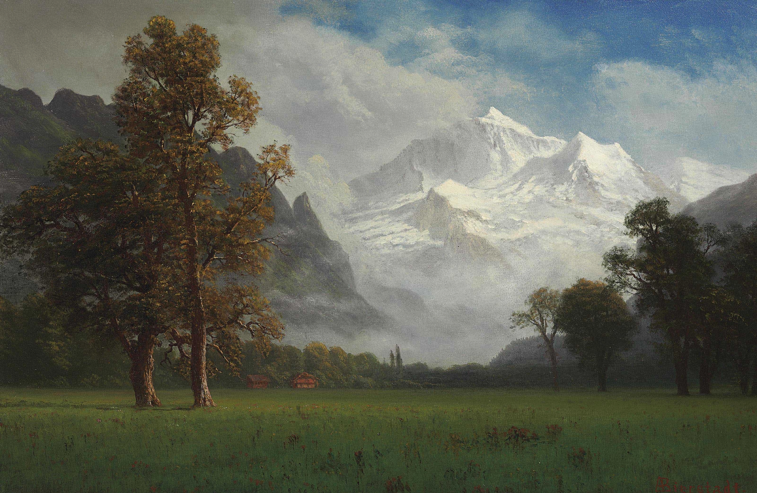
The date is unknown, but the relative immaturity and subject make it likely it was painted during this period.
He lived in Rome from 1857, where he hung out with Bierstadt and Gifford, and came back to the States in 1859. What we see is a dynamic network of developing artists learning from each other and the rich Western tradition.
On his return, he quickly established himself as a painter of his own brand of sublime landscapes.

Worthington Whittredge, Landscape with Haywain, 1861, oil on canvas, Cleveland Museum of Art
At times his work has a serene luminescence that recalls Kensett’s Luminism and Bricher’s transfigured tranquility.

Worthington Whittredge, Second Beach, Newport, 1865, oil on canvas
We'll finish an all-too-short look at Whittredge with a type of painting he becomes known for later in his career. These are magically lit deep woods scenes but more luminous than Cole and rougher than Durand.

Worthington Whittredge, The Emerald Pool, 1868, oil on canvas, Chrysler Museum of Art
Blazing color and reflections worthy of Church or Cropsey but in a close, intimate setting. There’s still a sense of the sublime beyond coming through the light. A nice counterpoint to House of Lies lies about organic life.

Worthington Whittredge, The Brook in the Woods, around 1885–86, oil on canvas, Metropolitan Museum of Art
Some of these scenes are remarkable for how they handle light in a tangled setting. It’s that careful observation that made the Hudson River School sublime so compelling, even today. Despite the gloom, it’s not foreboding. It’s an invitation to explore further. It’s why they’re still fascinating. The smudges? Well, a pompous atavist liked them.
Alternatively...

Anyhow, that's what was really going on with the founding and second generations of the Hudson River School. Just scratching the surface, really, but enough to introduce the big players and ideas so anyone interested can look further. And enough to expose the BAN for the beast nonsense that it is. The best way to blow up beast lies is with reality, and this huge post of paintings does just that. That’s the thing about the House of Lies. It’s inversions are always crushed by exposure to the truths they invert. By accepting the BAN as reality, how contrived and limiting it is can just be sidestepped. It’s not a question of judging the cultural relevance of [L+T] vs. [paint smudge] when it’s presented as natural progression.

Asher Brown Durand, The Beeches, 1845, oil on canvas, Metropolitan Museum of Art
This doesn’t even get addressed. We keep reiterating the point because we’re seeing the replacement of organic human expression with contrived atavistic inversion. By the very institutions tasked with preserving its history and legacy. We aren’t just making it up. How may more people know Whistler’s name than Durand’s? Good golly, just look at art today.
The BAN ensures that the actual relevant questions to a cultural history of art aren’t even asked. No talk of how contrived that was. No mention of why the audience appeal changed. Was there no market for big public exhibitions anymore? Did money men and beast institutions push them out? The experience of something as big and detailed as Heart of the Andes is fundamentally different from a cabinet picture. If art obviously changed, wouldn’t the logical question be why? Where did the old demand go? Where did the new one come from? Why did posturing around logically-impossible nonsense from Europe register as good? It’s pure illustrated narrative told with a matter of fact tone that discourages questions. Discourages thinking about paintings that real people were making for real contexts.
Before wrapping this installment, there’s one more relevant point to share. We’ve noted that the catalog is curiously silent on the European aspects of the Hudson River School. We’ve mentioned the recurring importance of the Düsseldorf School brand of Romantic painting. We’d like to close with a little glimpse of that popular and overlooked movement and let you judge the relevance. As an alternative to American provincial vs. Eurotrash sophisticate humiliation fairy tales..

Andreas Achenbach, Storm at Sea off the Norwegian Coast, 1837, oil on canvas, Städel Museum
One example by a Düsseldorf school leader. The helplessness of man in the face of natural forces and the sublimity of Creation are two main themes. It’s pure Romantic drama – all slashing diagonals and contrasting light – with the highest levels of techne.
The Düsseldorf school goes back to the age of Academies. It was founded in 1767 and from the 1830s became popular with foreign students, including Americans. At this point it promoted a sublime Romantic realism that took different national flavors. The German Andreas Achenbach and his brother Oswald epitomized the style at this time.
Düsseldorf school painters turn up among their nation’s leading artists, spreading the breathtaking style across the West. Keep the absence of this from the catalog – and BAN in general – in mind when looking at this nano-fraction of their work. And the dates.

Alexandre Calame, Der Vierwaldstättersee (Symphonie en bleu), 1855, Private collection, Switzerland
Probably the greatest Swiss Alpine landscape painter of the era. His color harmonies, light, and natural sublimity appeal to Hudson River School fans.
Russia has it’s own majestic landscape tradition that we may look at at some point. Their approach was slightly different, trying to evoke poetic moods. This despite the huffers claiming feeling and representation were mutually exclusive [note – broken record, but they’re so stupid]. Not totally different – the greatest Russian forest painter – maybe the greatest forest painter ever – studied in Düsseldorf.

Ivan Shishkin, Woodland, 1889, oil on canvas, Private collection
You have to see Shishkin and his fellows to really appreciate how a landscape can convey a poetic mood. There’s a vital energy that seems to radiate out through his paintings that’s different but related to what the Hudson River School did.
There’s a whole school of jaw-dropping Scandinavian Romantic nationalism with Düsseldorf ties. This really gets memory holed in the BAN. It does acknowledge that national sentiment was part of the “irrational” Romantic reactions to Enlightenment Reason. But the idea that it was driving works of haunting beauty in the late 19th century blows up the whole inevitability of the atavism Modernism Progress! lie.

Anders Askevold, The Return Home, 1889, private collection
This great Norwegian fjord painter is a Düsseldorf artist. As with the Hudson River School, there’s celebration of the sublimity of the natural landscape in harmony with organic culture. Some of the tehne is the same. But the details differ like the people they represent.
These Scandinavians are phenomenal. Like the Russian poetic landscapists or the Hudson River School, a magnificent organic national art of the West. The Düsseldorf Romanticism gives a common spiritual tie, but each with it's own flavor. Like the nations of the West they celebrate.

Adolph Tidemand & Hans Gude, Spear Fishing on Lake Krøderen, 1851, National Museum of Art, Architecture and Design, Oslo
Gude may be the greatest of the Norwegians, and also spent time in Düsseldorf. He would have known the Hudson River School guys.
Ignoring this Düsseldorf tie ignores a connection between the Hudson River School and a dominant popular aesthetic. But note how there isn’t a theoretical straightjacket put on these guys. They’re taught a certain kind of refined techne then encouraged to study nature and other Old Masters on their own. Basically real art training – get the techne then figure out the logos expressions. Opposite the idea of a centralized, non-representational, autonomous nonsense production machine. Which would have been fine if it stayed autonomously away from real art.
Romantic nationalism also means distinct national traditions - like Swedish folklore from a Düsseldorf artist. They may be appreciated aesthetically by others, but they aren’t intended to speak to them. This is how organic culture works. Imposed top-down centralization is a satanic inversion. Don’t take our word for it. Judge the product impartially. We don’t need narrative control to feel confident in that contest.
_-_Nationalmuseum_-_18226.tif.jpg)
The supernatural was a Romantic theme from way back. Click for a post on the inversion of the “Gothic”.
Bringing us back to the problem with Romanticism and secular transcendence. Its sublime effect points to the metaphysical, but it doesn’t define what that is. Readers can see consistency with Christian logos and the Ontological Hierarchy. But Enlightenment auto-idolatrs could also see their materialist fantasies here too – pantheistic Nature with the capital N. That said, at least it’s up to the viewer to parse out the truth. The alternative is no art at all.

Sanford Robinson Gifford, Rheinstein, 1872–74, Mildred Lane Kemper Art Museum, Washington University in St. Louis
Close with the tightest link between Düsseldorf and Hudson River Schools – the German member of both. Hermann Herzog (1832-1932) was a Düsseldorf school painter who relocated to the US and became a citizen. His work is a bridge between the two and speaks to their compatibility.
We don’t see much of Hermann in the catalog.

Herman Herzog, Alpine Landscape, undated, oil on canvas, private collection
Herzog was very prolific and traveled extensively to paint. We can’t possibly do justice to his career, but a few highlights will tie off the Düsseldorf-Hudson River School connection. There’s a lot of Achenbach in him.
We’ve mentioned that the dramatic viewpoints with diagonal structures in the Hudson River School painters comes from this German Romanticism. It’s very different from the horizontal Dutch diagonals of Cole. One mor example of how organic art draws on different sources to create effective representations.

Hermann Herzog, Alpine Village, 1872, , oil on canvas, private collection
Düsseldorf style Herzog shows the natural affinities between their Alpine painting and the Hudson River School love of mountains.
It’s just as easy to see how easily he adapts to his new North American setting. Like an up-close diagonal view of a Pennsylvania waterfall.

Hermann Herzog, Winona Falls, 1877, oil on canvas, St. Louis Art Museum
Or the Western mountain sublimity that drew Bierstadt...

Herman Herzog, Caribou by a Mountain Lake, 1865, oil on canvas, National Museum of Wildlife Art, Jackson, WY
Of course, no one is quite like Bierstadt...
.jpg)
Albert Bierstadt, Lake in the Sierra Nevada, 1867, oil on canvas, private collection
There are times where Herzog embraces some of that spectacular Bierstadt quality though. Like all these painters, the common vision creates different similarities between them.

He’s not as big as Bierstadt’s grandest panoramas either. But 34 3/4 by 54 inches is not a cabinet picture. The technical information on sales catalog pages is interesting. Analytic techniques are refined. They’d have to be, given the costs. Not beast laundry tier, but 5-6 figure purchases aren’t taken lightly.
The influence and success of the School leaders incentivized others to experiment with the different possibilities they were opening. Not as a set of rules to determine the timeless parameters of “Art” forevermore. Because they’re beautiful and point to deeper truths.
And Bierstadt didn’t only paint phantasmagoric spectacles. Like all the Hudson River School painters, he studied natural phenomena carefully and could paint in different stylistic modes. To a point. There’s a light and color that comes from his paint handling choices that’s unmistakably him. This is the kind of stylistic “fingerprint” that lets expert identify who made unknown paintings.
.jpg)
Albert Bierstadt, South Dome, Yosemite Valley, California, 1863-67, oil on paper laid down on canvas, private collection
Look closely at this and at Among the Sierra Nevada, California. Despite the obvious differences, even the photos here show they’re painted by the same guy. Big things like color and light or how common things like rocks and trees are painted. But also fine details – like the brush marks, if the resolution is high enough.
It’s not one of his huge paintings, but at 26 x 19 inches, it’s more then a sketch. More finished too. A smaller painting like this would be sold to a private collector or group instead of being shown as a spectacle.
The difference between Bierstadt’s two paintings above shows why we’ve been blathering about more attention to who was seeing these and how they were seen.
Consider this post alone. There are pictures of ranging in size from a few inches to well over 10 feet. Some were big public spectacles, some were commissioned by various bodies for different purposes, some were for private patrons, some were sold at exhibition, some were prep works for the painter’s own use, some were for the artist’s family, friends, or personal collection, etc. The artist always has the same skill set, but wildly different sizes and audiences have to have a huge effect on what is represented and how. This matters, because if art is a cultural expression, it’s worthwhile to know what part of culture is being expressed. We suspect the reduction of this incredible diversity of options to small photos in around the same sizes conditions BAN-huffers not to pay much attention. Especially if all of them are just mile markers on the road to smudges.
It’s indicative of Herzog’s wide travels that he’s the Hudson River School artist who most painted Florida.

Hermann Herzog, Florida Sunset, 19th century, oil on canvas, private collection
Sunset sublimity carries into the reflections – a Floridian spin on a Hudson River School standard.
Prolific output and wide range extends to Romantic moonlight painting. We aren’t quibbling when we note his catalog omission is odd.

Hermann Herzog, View of Niagara Falls in Moonlight, 1872, oil on canvas, Museum of Fine Arts, Springfield, MA
This photo is a bit dark, but it captures the dramatic light contrasts. Especially the effect of little human lights in the sublime splendor.
The more accurate issue isn’t cosmopolitan vs. colonial. It’s which European influences and why. That’s a very different narrative. But presenting the narrative honestly – atavistic-leaning money capturing institutions – raises uncomfortable questions of responsibility and choice. Best to pretend art became obsessed with colored haze for no reason at all.
That’s got to do it for the main figures of the second generation. There were over seventy painters connected to the Hudson River School, so no claim to cover them all. But an overview of what the big themes and leading creators were doing. The next post will take up the third generation, the aftermath, and conclude the Abstract-Material-Apprehensible issues. Perhaps what the Trinity looks like through the Ontological Hierarchy first.
Until then, enjoy the scenery. It's sublime...

Herman Herzog, Sketching on Beaver’s Creek, 1880-1885, oil on canvas, Grand Rapids Art Museum


No comments:
Post a Comment